
Gradhermetic branding & website
Gradhermetic branding & website
Gradhermetic branding & website
Gradhermetic branding & website
Gradhermetic branding & website
We connect an industrial brand with architects from all over the world
We connect an industrial brand with architects from all over the world
We connect an industrial brand with architects from all over the world
We connect an industrial brand with architects from all over the world
We connect an industrial brand with architects from all over the world

DESCRIPTION
DESCRIPTION
DESCRIPTION
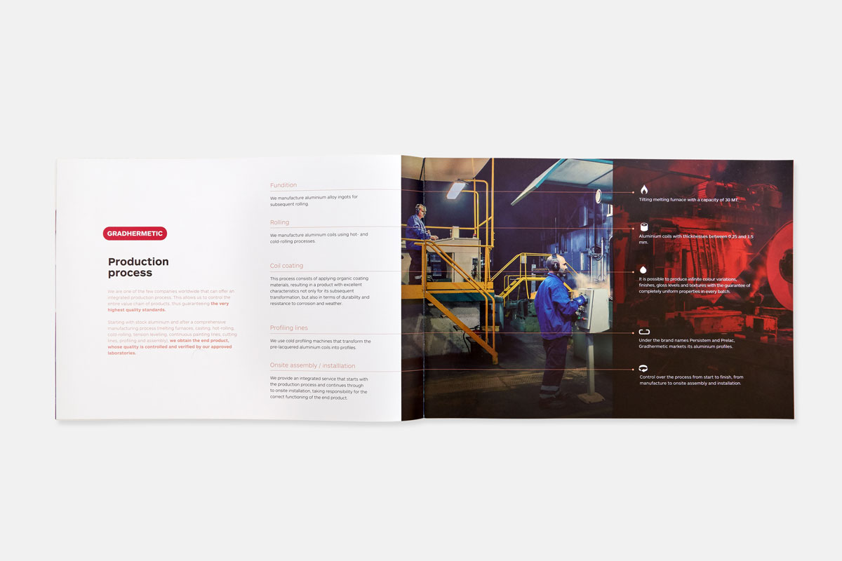
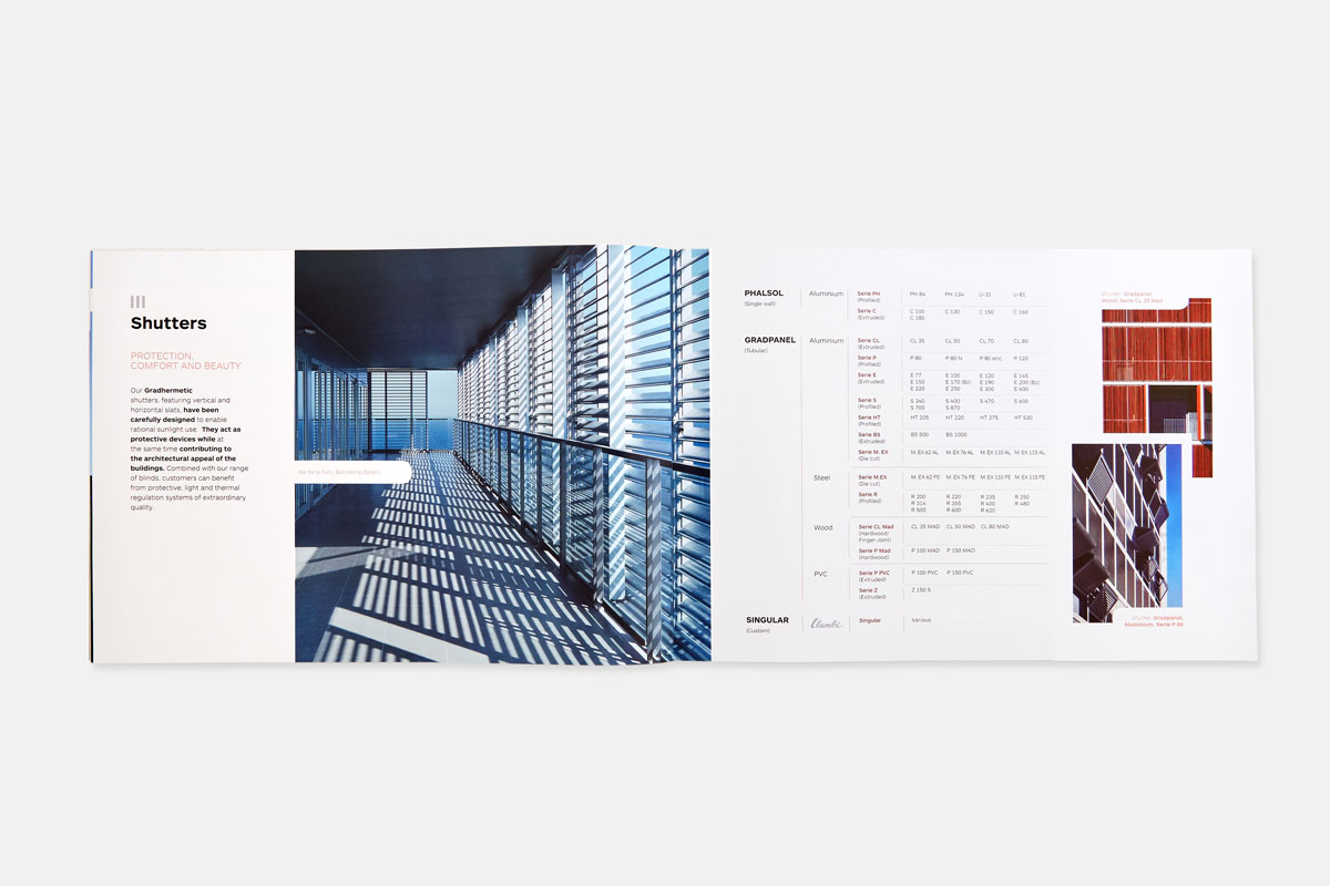
In 1954, when the closing and security of the windows was limited to the rolling blinds of wood, Jaume Colom conceived the creation of a blind allowing the graduation and control of light. The Gradhermetic society is established in 1954 to industrialize and commercialize this new and revolutionary product. Today, after three generations, Industrial Gradhermetic is a multinational company, leader on the energy efficiency improvement of buildings, counting with a complete productive process and offering a unique range of products such as blinds, latticework and false ceilings. Products used in buildings and emblematic architectural works around the world.
In 1954, when the closing and security of the windows was limited to the rolling blinds of wood, Jaume Colom conceived the creation of a blind allowing the graduation and control of light. The Gradhermetic society is established in 1954 to industrialize and commercialize this new and revolutionary product. Today, after three generations, Industrial Gradhermetic is a multinational company, leader on the energy efficiency improvement of buildings, counting with a complete productive process and offering a unique range of products such as blinds, latticework and false ceilings. Products used in buildings and emblematic architectural works around the world.
L’any 1954, quan el tancament i la seguretat de In 1954, when the closing and security of the windows was limited to the rolling blinds of wood, Jaume Colom conceived the creation of a blind allowing the graduation and control of light. The Gradhermetic society is established in 1954 to industrialize and commercialize this new and revolutionary product. Today, after three generations, Industrial Gradhermetic is a multinational company, leader on the energy efficiency improvement of buildings, counting with a complete productive process and offering a unique range of products such as blinds, latticework and false ceilings. Products used in buildings and emblematic architectural works around the world.
In 1954, when the closing and security of the windows was limited to the rolling blinds of wood, Jaume Colom conceived the creation of a blind allowing the graduation and control of light. The Gradhermetic society is established in 1954 to industrialize and commercialize this new and revolutionary product. Today, after three generations, Industrial Gradhermetic is a multinational company, leader on the energy efficiency improvement of buildings, counting with a complete productive process and offering a unique range of products such as blinds, latticework and false ceilings. Products used in buildings and emblematic architectural works around the world.
In 1954, when the closing and security of the windows was limited to the rolling blinds of wood, Jaume Colom conceived the creation of a blind allowing the graduation and control of light. The Gradhermetic society is established in 1954 to industrialize and commercialize this new and revolutionary product. Today, after three generations, Industrial Gradhermetic is a multinational company, leader on the energy efficiency improvement of buildings, counting with a complete productive process and offering a unique range of products such as blinds, latticework and false ceilings. Products used in buildings and emblematic architectural works around the world.
INFO
INFO
Client: Gradhermetic
Services: Branding, corporate identity manual, advertising, applications, web design
Team involved: 6
Client: Gradhermetic
Services: Branding, corporate identity manual, advertising, applications, web design
Team involved: 6
Client: Gradhermetic
Services: Branding, corporate identity manual, advertising, applications, web design
Team involved: 6
Client: Gradhermetic
Services: Branding, corporate identity manual, advertising, applications, web design
Team involved: 6
1
1
The challenge
The challenge
The challenge
With regard to visual identity, the challenge is to modernize the brand without losing its legacy, which goes back to 1954, and provide an identity manual that conveys clarity and consistency to the different audiences of Gradhermetic.
On the other hand, the challenge of the new web design lies in the organization of information and its accessibility. Considering that the range of Gradhermetic products envisages three large families, eleven subfamilies and hundreds of products, it is essential to be able to discriminate in an agile way the product we seek, through its technical and functional characteristics, making it easy for the user to access to a large amount of information.
2
2
The process
The process
The process
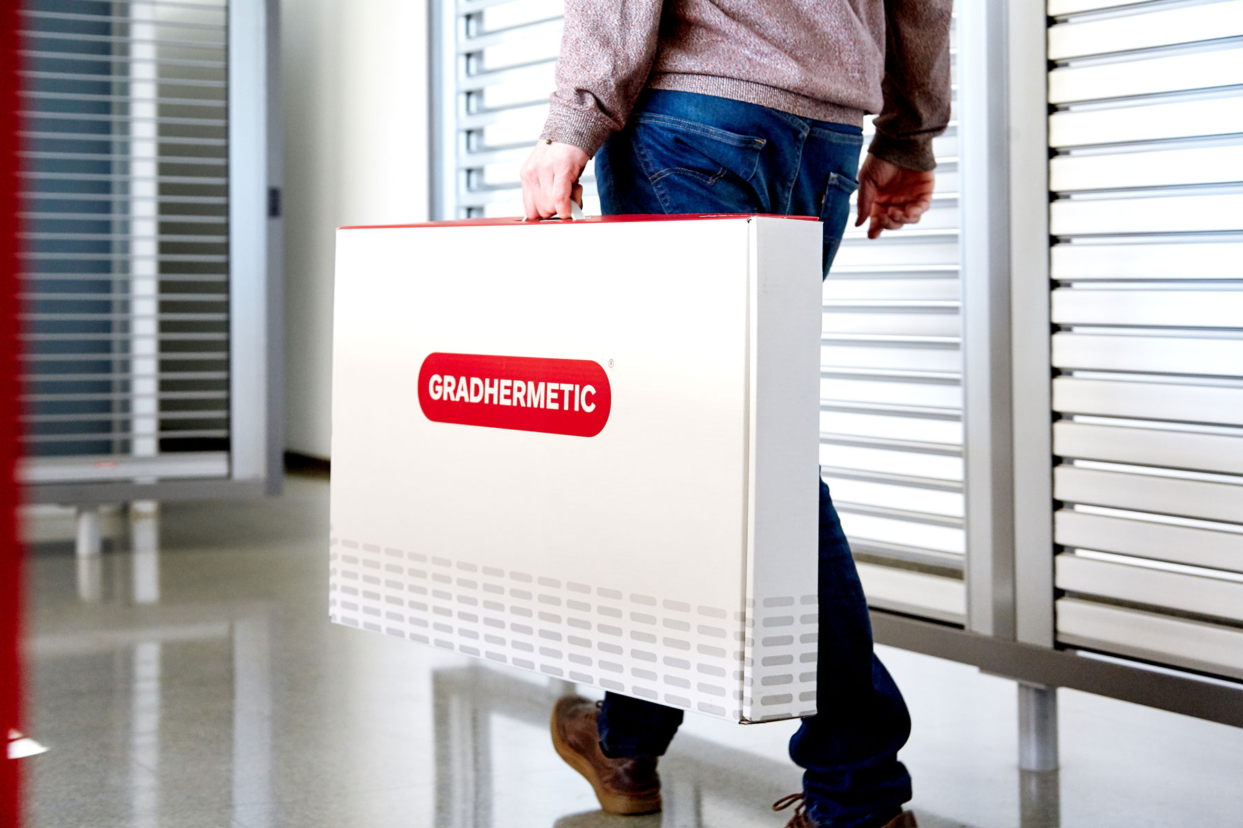
We develop a visual synthesis exercise, keeping identifying features that have remained immutable over the years: a rectangular base that encompasses the logo, a sans serif font and a specific chromatic code. We have balanced the weight of a new typography with a cleaner and lighter look and created an entire graphic system based on the abstraction of light filtering through blinds and lattices with different structures.
With regard to the web, we have focused the first art direction decisions to make all its ecosystem breathe a very architectural tone: clean, sober and well spaced. A simple but solid base grid and the appropriate typographic treatment provide consistency to the design. The use of color has been restricted to corporate red and a range of grays. Photography has a privileged role that, while has a seductive function, helps us connect the product with its practical applications.
Paying special attention in resolving fast access to the wide range of products, we have developed a navigation menu that allows us to quickly identify the product we are searching and access it from anywhere in the site. We have also developed a filter system that allows us to discriminate the products due to their characteristics, a company section to talk about history, company values and their international presence, a section for architectural projects, a corporate blog and a download page with technical documentation restricted to customers.
3
3
The results
The results
The results
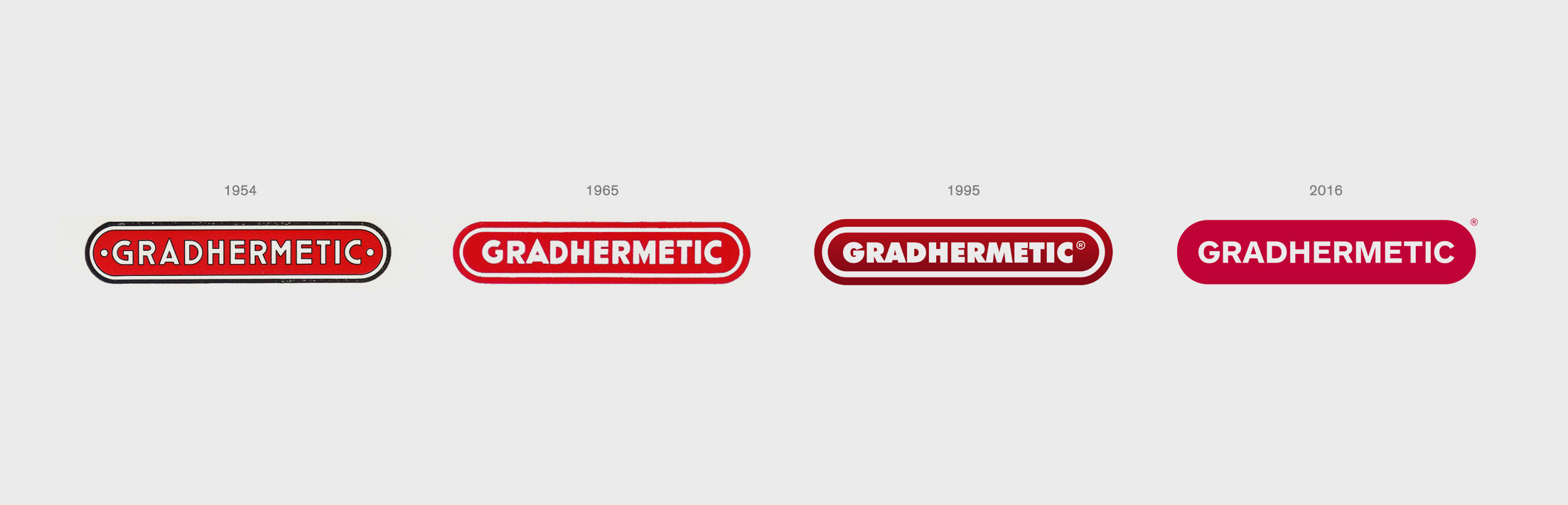
The result of the process is a rigorous revision of the brand that maintains the essence of the original logo (1954), with a new version that discards any type of accessory element and that is for this reason fully identifiable.
As for the web, we obtain a design that conveys elegance and efficiency—in accordance with the principles that govern the brand— and that connects very well with Gradhermetic's objective public, formed mainly by architecture studios. The new website, which is presented in six different languages, is also a fundamental tool for the marketing and sales team and plays a very important role in the process of internationalization of the company.
The result of the process is a rigorous revision of the brand that maintains the essence of the original logo (1954), with a new version that discards any type of accessory element and that is for this reason fully identifiable.
As for the web, we obtain a design that conveys elegance and efficiency—in accordance with the principles that govern the brand—- and that connects very well with Gradhermetic's objective public, formed mainly by architecture studios. The new website, which is presented in six different languages, is also a fundamental tool for the marketing and sales team and plays a very important role in the process of internationalization of the company.


© Baku Creativitat i Comunicació SL
© Baku Creativitat i Comunicació SL
© Baku Creativitat i Comunicació SL
© Baku Creativitat i Comunicació SL
© Baku Creativitat i Comunicació SL