
INS Terrassa branding & website
INS Terrassa branding & website
INS Terrassa branding & website
INS Terrassa branding & website
INS Terrassa branding & website
We connect the Institut de Terrassa with its city
We connect the Institut de Terrassa with its city
We connect the Institut de Terrassa with its city
We connect the Institut de Terrassa with its city
We connect the Institut de Terrassa with its city

DESCRIPTION
DESCRIPTION
DESCRIPTION
The INS (Institute of Terrassa), founded in 1955, is an educational reference in the city, which has grown to consolidate the widest and most diverse educational offer in the Vallès Occidental region. The center's educational community comprises more than 1800 students and 150 teachers.
The institute needed to completely update its visual identity and rethink its online presence, through a global project that not only presented its new image to old and new users, but also covers all the needs that students, teachers and potentials interested in its training offer could have. From purely communicative issues to easy access to all types of documentation and resources.
INFO
INFO
Client: INS Terrassa
Services: Branding, corporate identity manual, advertising, applications, web design
Team involved: 4
Client: INS Terrassa
Services: Branding, corporate identity manual, advertising, applications, web design
Team involved: 4
Client: INS Terrassa
Services: Branding, corporate identity manual, advertising, applications, web design
Team involved: 4
Client: INS Terrassa
Services: Branding, corporate identity manual, advertising, applications, web design
Team involved: 4
Client: INS Terrassa
Services: Branding, corporate identity manual, advertising, applications, web design
Team involved: 4
1
1
The challenge
The challenge
The challenge
The challenge is to create a brand new image for the INS, which attends to the current discourse of the center and its main values: proximity to students and their accompaniment, the quality and diversity of the educational offer, and the link between the center and the city. A brand that represents a clear step forward that totally revitalizes its visual ecosystem and projection.
Regarding its website, the challenge is to reorganize the online ecosystem of INS Terrassa, initially very disjointed and visually inconsistent, with information present in different platforms with their respective management accesses. The fundamental need of the new website is to serve as a starting point from which to access existing resources, useful for students and teachers, as well as offering a renewed and effective experience for new and potential users.
2
2
The process
The process
The process
We establish a new visual system configuring chromatic, typographic and structural codes. The color system starts with values present in learning: a fresh and soft green that expresses serenity and calm, an orange that brings determination, enthusiasm and passion and a blue, usually linked to intellectuality, the mind and its processes.
The corporate elements we have designed conceptually represents the multiplicity of paths that a student can choose and resort to the center. It is built on the basis of an initial graphic element that we can duplicate and tie with other elements to generate elaborate compositions or patterns that help the generation of visual identity.
To solve the web, we carry out a complete structuring process of the information scattered on several existing websites, facilitating access to the different sources of information and resources for students. We identify key functional needs and types of user with their particular needs.
At the same time, photographic sessions are directed to show the diversity of the center and its reality in the day to day, presenting all the main sections present on the web, usually focused on effective access to information.
The resulting design is sober and structurally simple, and making use of punctual visual elements, combined with large spaces and calls to action, configures a project that is suitable for a wide spectrum of users.
3
3
The results
The results
The results
We get a direct and modern brand, which stands out for its rigor and simplicity and that speaks of opening doors to the future and the link between the center and the city. It is this graphic simplicity that gives us a long-haul brand, which at the same time has a strong symbolic load.
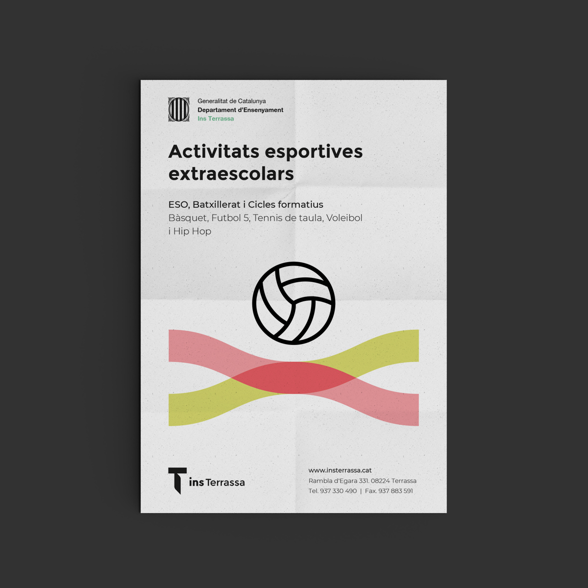
Together with the brand, INS Terrassa receives a scalable visual system that has an impact on all kinds of applications where the brand has a presence.
Its new website unifies all the existing contents around the INS Terrassa, in an orderly, hierarchical and coherent way, creating a simple and direct experience, both for students and teachers of the center as well as for those interested in its educational offer, while putting in action the new visual identity.
We get a direct and modern brand, which stands out for its rigor and simplicity and that speaks of opening doors to the future and the link between the center and the city. It is this graphic simplicity that gives us a long-haul brand, which at the same time has a strong symbolic load.
Together with the brand, INS Terrassa receives a scalable visual system that has an impact on all kinds of applications where the brand has a presence.
Its new website unifies all the existing contents around the INS Terrassa, in an orderly, hierarchical and coherent way, creating a simple and direct experience, both for students and teachers of the center as well as for those interested in its educational offer, while putting in action the new visual identity.


© Baku Creativitat i Comunicació SL
© Baku Creativitat i Comunicació SL
© Baku Creativitat i Comunicació SL
© Baku Creativitat i Comunicació SL
© Baku Creativitat i Comunicació SL