
Branding and social media for the Mercat de la Independència
Branding and social media for the Mercat de la Independència
Branding and social media for the Mercat de la Independència
Branding and social media for the Mercat de la Independència
Branding and social media for the Mercat de la Independència
An iconic and vibrant visual identity for the Mercat de la Independència de Terrassa
An iconic and vibrant visual identity for the Mercat de la Independència de Terrassa
An iconic and vibrant visual identity for the Mercat de la Independència de Terrassa
An iconic and vibrant visual identity for the Mercat de la Independència de Terrassa
An iconic and vibrant visual identity for the Mercat de la Independència de Terrassa

DESCRIPTION
DESCRIPTION
DESCRIPTION
DESCRIPTION
The Mercat de la Independència de Terrassa is the central market of the city. In its origins there was a previous market –documented in the year 1207– that was held in the current Plaça Vella, before moving it to a permanent building.
Currently, the market is located in an emblematic modernist building by the municipal architects Antoni Pascual Carretero and Melcior Vinyals Muñoz. It is made up of more than 80 shops, which represent the widest and most diverse offer of fresh and quality products in the region.
The Mercat de la Independència de Terrassa is the central market of the city. In its origins there was a previous market –documented in the year 1207– that was held in the current Plaça Vella, before moving it to a permanent building.
Currently, the market is located in an emblematic modernist building by the municipal architects Antoni Pascual Carretero and Melcior Vinyals Muñoz. It is made up of more than 80 shops, which represent the widest and most diverse offer of fresh and quality products in the region..
INFO
Client: Mercat de la Independència
Services: Brand consulting, brand, identity manuals, applications, advertising, photography, social media
Team involved: 3
Client: Mercat de la Independència
Services: Brand consulting, brand, identity manuals, applications, advertising, photography, social media
Team involved: 3
Client: Mercat de la Independència
Services: Brand consulting, brand, identity manuals, applications, advertising, photography, social media
Team involved: 3
Client: Mercat de la Independència
Services: Brand consulting, brand, identity manuals, applications, advertising, photography, social media
Team involved: 3
Client: Mercat de la Independència
Serveis: Brand consulting, brand, identity manuals, applications, advertising, photography, social media
Team involved: 3
1
1
1
The challenge
The challenge
The challenge
The project starts with the need to create an identity that represents the traditional values of the Mercat ––quality, proximity, local culture and responsible consumption–– and that connects with the city of Terrassa. A modern brand, capable of representing the particular way of being of the Mercat and that completely revitalizes its visual ecosystem and its projection.
The project starts with the need to create an identity that represents the traditional values of the Mercat ––quality, proximity, local culture and responsible consumption–– and that connects with the city of Terrassa. A modern brand, capable of representing the particular way of being of the Mercat and that completely revitalizes its visual ecosystem and its projection.
The project starts with the need to create an identity that represents the traditional values of the Mercat ––quality, proximity, local culture and responsible consumption–– and that connects with the city of Terrassa. A modern brand, capable of representing the particular way of being of the Mercat and that completely revitalizes its visual ecosystem and its projection.
The project starts with the need to create an identity that represents the traditional values of the Mercat ––quality, proximity, local culture and responsible consumption–– and that connects with the city of Terrassa. A modern brand, capable of representing the particular way of being of the Mercat and that completely revitalizes its visual ecosystem and its projection.
The project starts with the need to create an identity that represents the traditional values of the Mercat ––quality, proximity, local culture and responsible consumption–– and that connects with the city of Terrassa. A modern brand, capable of representing the particular way of being of the Mercat and that completely revitalizes its visual ecosystem and its projection.
2
2
The process
The process
The process
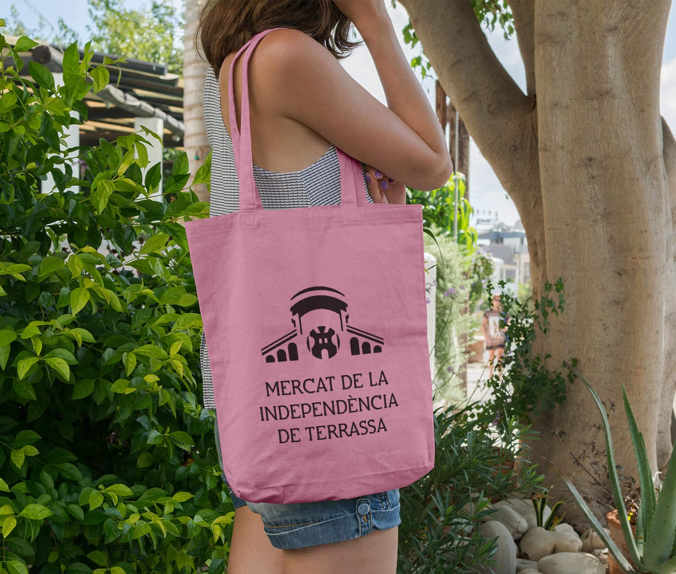
In the process of building the new visual identity of the Mercat, we used its façade and its most characteristic components –the vault, the windows, the emblematic wrought iron castle and the original, modernist-style typography– to build a brand with an iconic identity, that tends to simplicity and communicative clarity. We recovered the original typography, which has a unique personality and connects with the city and its history, restyled it and incorporated it into the brand.
Beyond the original typeface that is part of the brand, we adopted Montserrat as the main typeface for basic and informative texts, and ITC Souvenir as a secondary typeface to be used in combination with the first to create prominent texts and headlines.
Color are incorporated into the Mercat identity manual as a powerful element of communication, which acts as a counterpoint to the sober and timeless character of the brand, which is always expressed in black. Cheerful, optimistic and energizing, the Mercat's color palette is made up of vibrant colors –such as aubergine, turquoise, lemon green, orange and pink–, with vitalist resonances, which speak to us of the Mercat's way of being and the human treatment that configures a unique shopping experience.
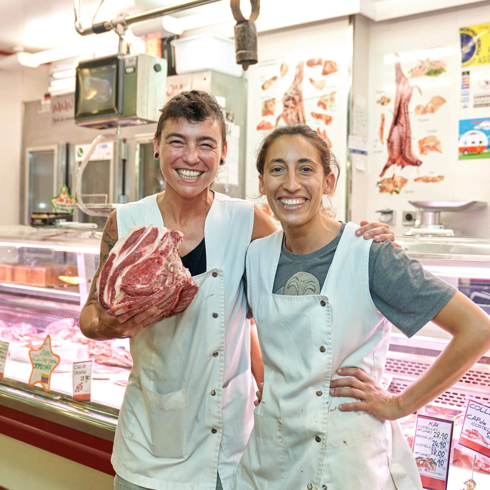
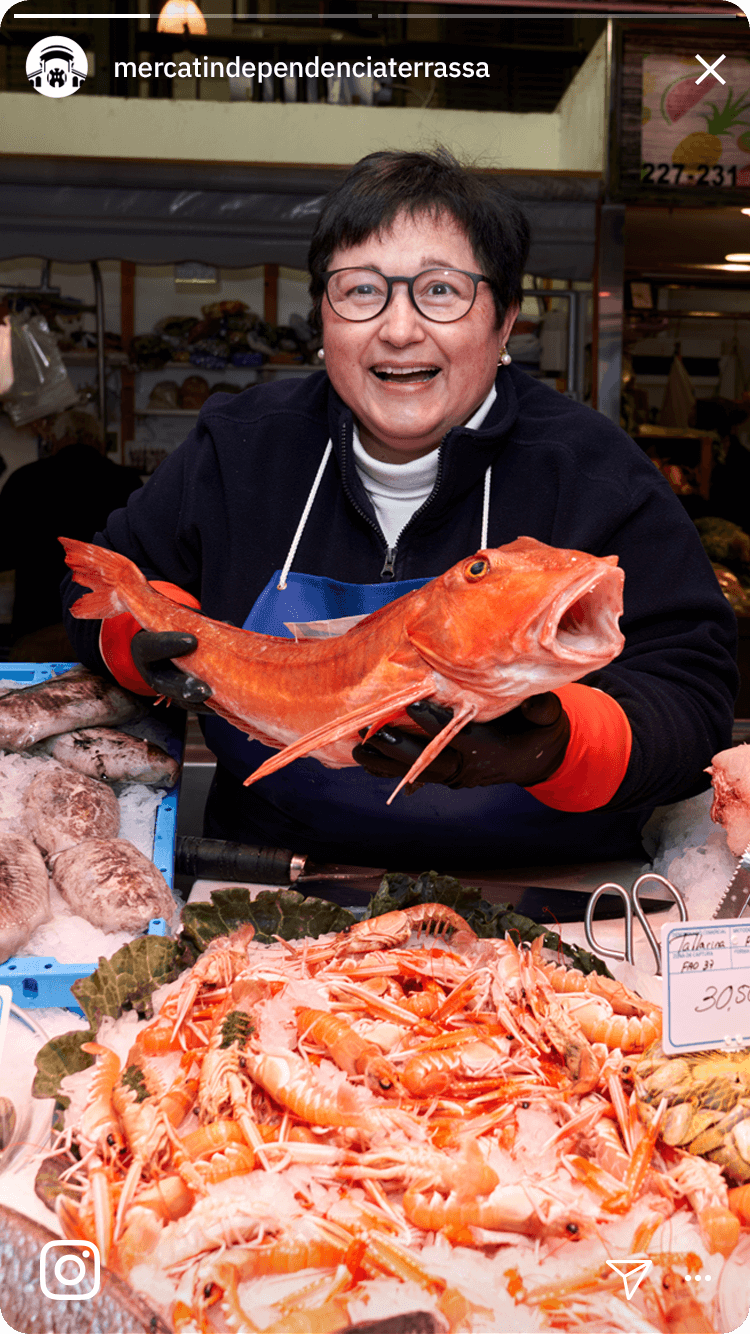
The photographic art direction is also incorporated into the manual to build an empathetic visual discourse, which seeks the leading role of people, showing them authentically and with an inclusive and open will, with a positive tone and capable of connecting with the different audiences of the Mercat.
In the process of building the new visual identity of the Mercat, we used its façade and its most characteristic components –the vault, the windows, the emblematic wrought iron castle and the original, modernist-style typography– to build a brand with an iconic identity, that tends to simplicity and communicative clarity. We recovered the original typography, which has a unique personality and connects with the city and its history, restyled it and incorporated it into the brand.
Beyond the original typeface that is part of the brand, we adopted Montserrat as the main typeface for basic and informative texts, and ITC Souvenir as a secondary typeface to be used in combination with the first to create prominent texts and headlines.
Color are incorporated into the Mercat identity manual as a powerful element of communication, which acts as a counterpoint to the sober and timeless character of the brand, which is always expressed in black. Cheerful, optimistic and energizing, the Mercat's color palette is made up of vibrant colors –such as aubergine, turquoise, lemon green, orange and pink–, with vitalist resonances, which speak to us of the Mercat's way of being and the human treatment that configures a unique shopping experience.
The photographic art direction is also incorporated into the manual to build an empathetic visual discourse, which seeks the leading role of people, showing them authentically and with an inclusive and open will, with a positive tone and capable of connecting with the different audiences of the Mercat.
3
3
The results
The results
The results
We obtain an iconic and long-standing brand, which is rooted in the traditional values of the institution to transform and modernize with a vibrant, cheerful and warm personality, which synthesizes the way of being of the market and seeks connection with its city.
The visual identity manual includes the brand, its rules of use, fonts, color palette and photographic art direction –among others–, as well as various specific applications of advertising and digital graphics.


© Baku Creativitat i Comunicació SL
© Baku Creativitat i Comunicació SL
© Baku Creativitat i Comunicació SL
© Baku Creativitat i Comunicació SL
© Baku Creativitat i Comunicació SL