
El Cresol branding
El Cresol branding
El Cresol branding
El Cresol branding
El Cresol branding
Kitchen and shop in the Mercat de la Independència in Terrassa
Kitchen and shop in the Mercat de la Independència in Terrassa
Kitchen and shop in the Mercat de la Independència in Terrassa
Kitchen and shop in the Mercat de la Independència in Terrassa
Kitchen and shop in the Mercat de la Independència in Terrassa

DESCRIPTION
DESCRIPTION
DESCRIPTION
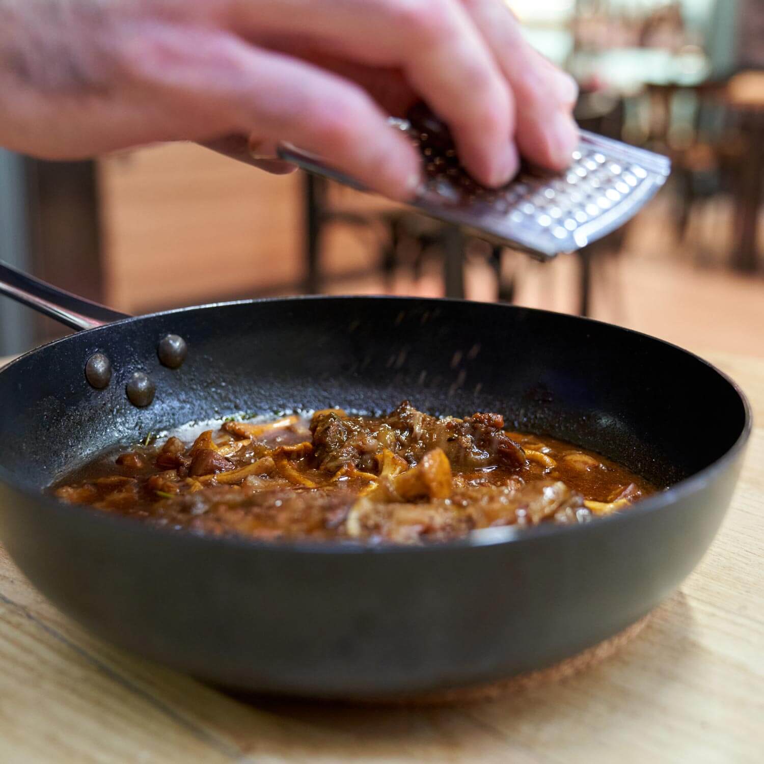
El Cresol is committed to traditional and authentic cuisine, which has a lot to do with the product, the territory and its people. The resources and quality offered by the Mercat de la Independència –where El Cresol has its privileged location–, as well as the collaboration with producers, artisans and cooperatives from Terra Alta and Terres de l'Ebre, are the core of a restaurant that takes the Catalan culinary tradition as a reference to build a contemporary project.
El Cresol is committed to traditional and authentic cuisine, which has a lot to do with the product, the territory and its people. The resources and quality offered by the Mercat de la Independència –where El Cresol has its privileged location–, as well as the collaboration with producers, artisans and cooperatives from Terra Alta and Terres de l'Ebre, are the core of a restaurant that takes the Catalan culinary tradition as a reference to build a contemporary project.
El Cresol is committed to traditional and authentic cuisine, which has a lot to do with the product, the territory and its people. The resources and quality offered by the Mercat de la Independència –where El Cresol has its privileged location–, as well as the collaboration with producers, artisans and cooperatives from Terra Alta and Terres de l'Ebre, are the core of a restaurant that takes the Catalan culinary tradition as a reference to build a contemporary project.
El Cresol is committed to traditional and authentic cuisine, which has a lot to do with the product, the territory and its people. The resources and quality offered by the Mercat de la Independència –where El Cresol has its privileged location–, as well as the collaboration with producers, artisans and cooperatives from Terra Alta and Terres de l'Ebre, are the core of a restaurant that takes the Catalan culinary tradition as a reference to build a contemporary project.
El Cresol is committed to traditional and authentic cuisine, which has a lot to do with the product, the territory and its people. The resources and quality offered by the Mercat de la Independència –where El Cresol has its privileged location–, as well as the collaboration with producers, artisans and cooperatives from Terra Alta and Terres de l'Ebre, are the core of a restaurant that takes the Catalan culinary tradition as a reference to build a contemporary project.
INFO
INFO
Client: El Cresol
Services: Brand consulting, concept, brand, identity manual, brand applications
Team involved: 3
Client: El Cresol
Services: Brand consulting, concept, brand, identity manual, brand applications
Team involved: 3
Client: El Cresol
Services: Brand consulting, concept, brand, identity manual, brand applications
Team involved: 3
Client: El Cresol
Services: Brand consulting, concept, brand, identity manual, brand applications
Team involved: 3
Client: El Cresol
Services: Brand consulting, concept, brand, identity manual, brand applications
Team involved: 3
1
1
The challenge
The challenge
The challenge
The challenge
The project starts with the need to create a new visual identity that emphasises the traditional values of El Cresol, while adapting the brand to the new times, making it visible in the city.
The project starts with the need to create a new visual identity that emphasises the traditional values of El Cresol, while adapting the brand to the new times, making it visible in the city.
The result is a modern brand - while remaining linked to traditional values - that claims its personality with a close and powerful identity, which connects its message with the city and its people.
The visual identity manual includes the brand, its rules of use, typographies, colour palette and accessory graphics, among others, as well as different specific applications for signage, advertising and digital graphics.
The project starts with the need to create a new visual identity that emphasises the traditional values of El Cresol, while adapting the brand to the new times, making it visible in the city.
The project starts with the need to create a new visual identity that emphasises the traditional values of El Cresol, while adapting the brand to the new times, making it visible in the city.
2
2
The process
The process
The process
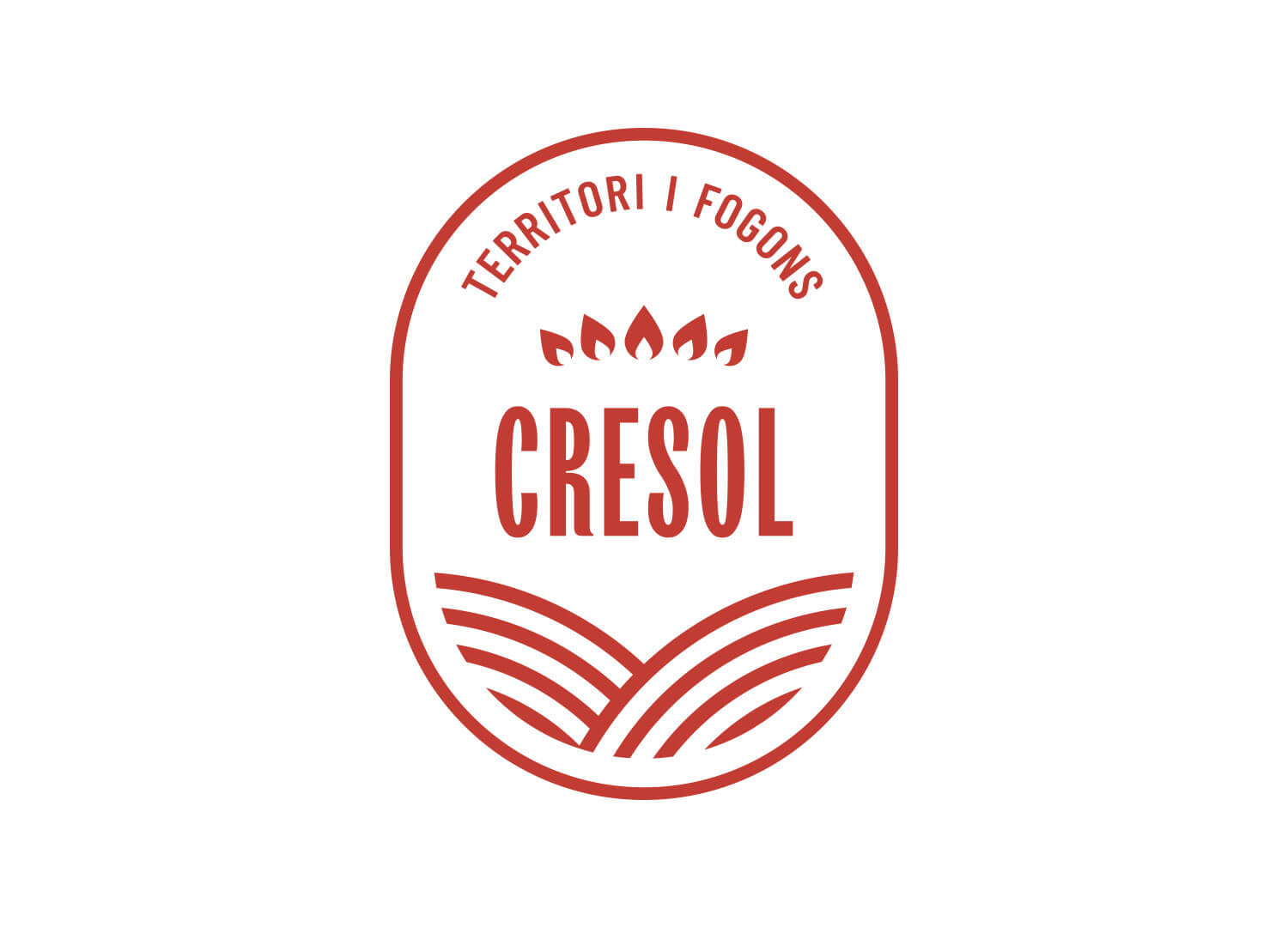
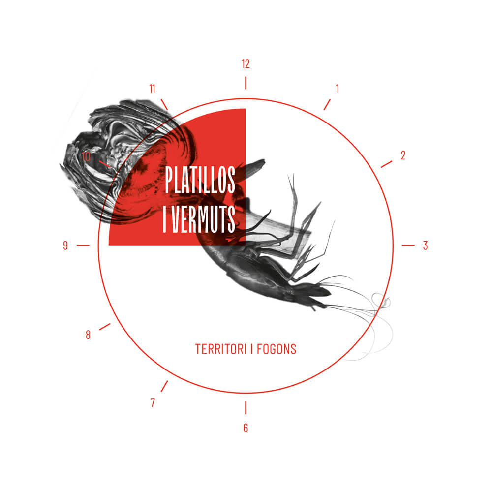
We designed a brand that expresses itself with a compact symbol. An oval that reminds us of a seal of quality, inside which the two most relevant elements of its personality are represented: cuisine and territory. The brand positioning is reinforced with simple texts - "Territori i fogons!" and "Cuina i botiga al Mercat de la Independència"-, which speak to us of two key aspects: its identity and its location. The corporate typefaces are TT Trailers and Barlow Condensed, with a contemporary design and a slight retro touch, which bring us closer to values associated with tradition.
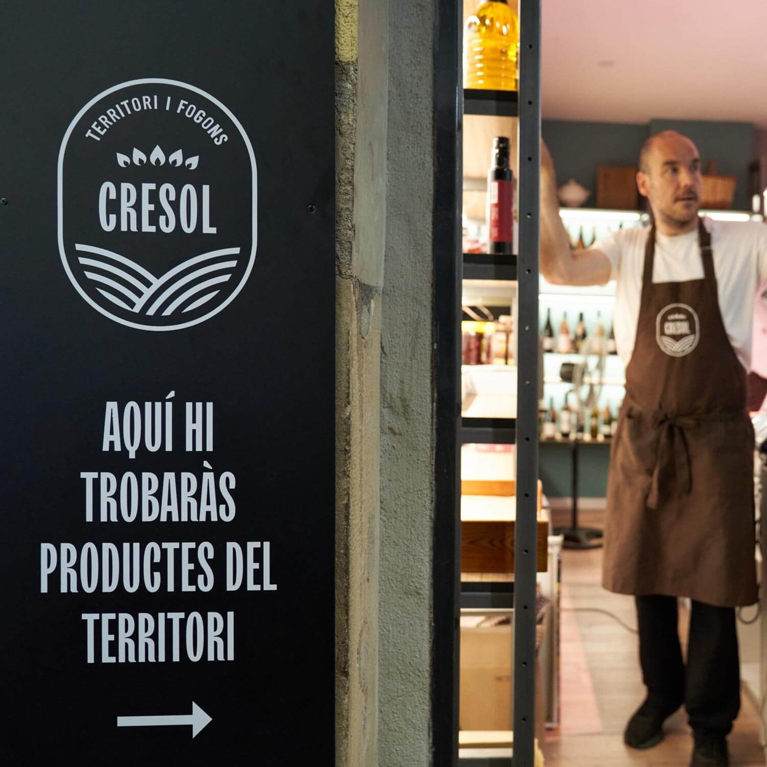
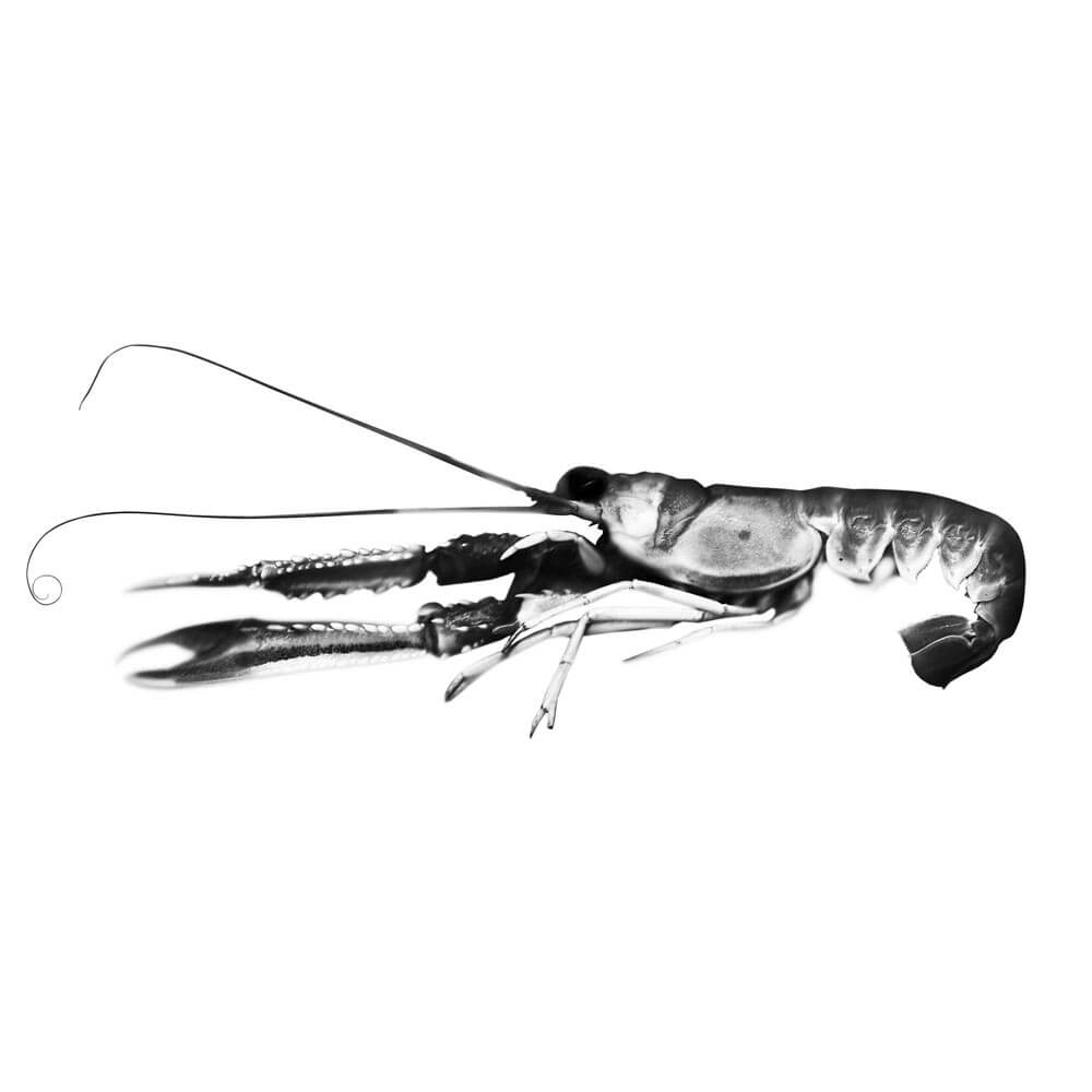
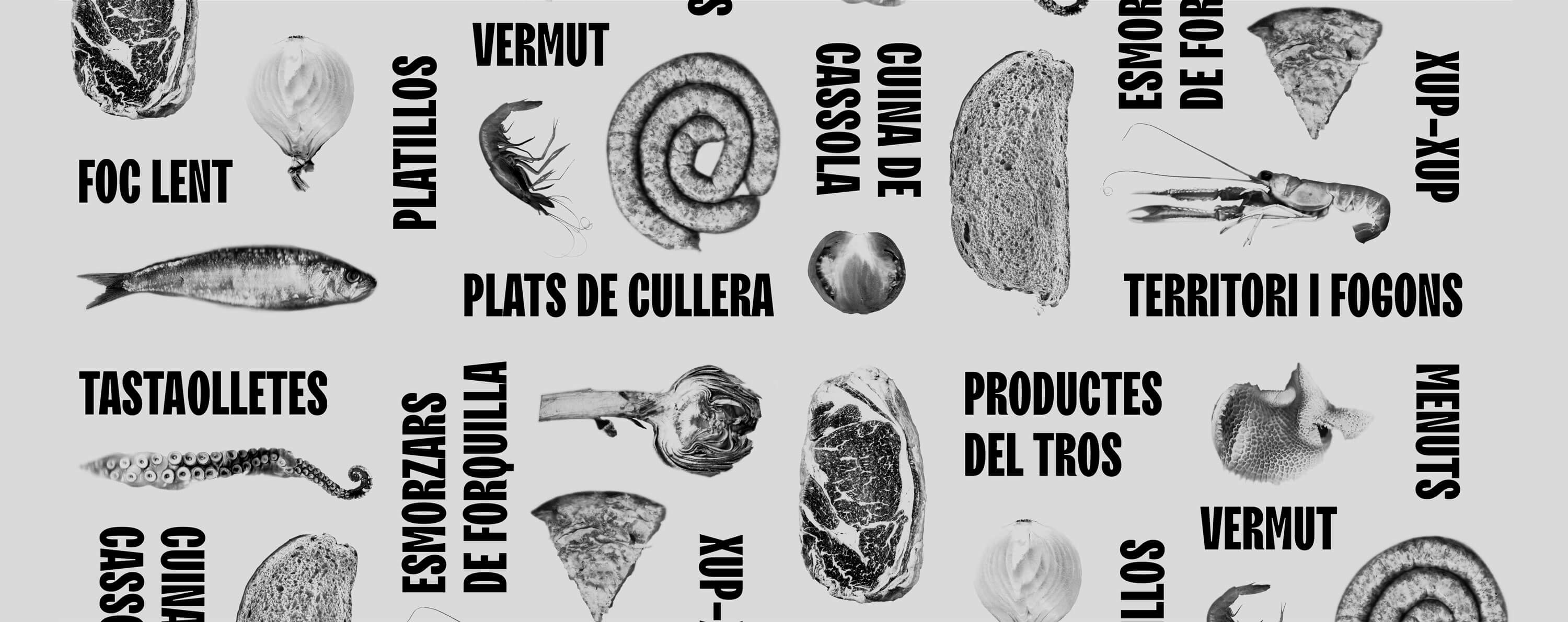
Accompanying the brand, we created an accessory graphic that uses a set of real products and textures, creating a system of interchangeable pieces to build different applications. Having it prevents us from overusing the brand symbol, diversifying the visual discourse.
We designed a brand that expresses itself with a compact symbol. An oval that reminds us of a seal of quality, inside which the two most relevant elements of its personality are represented: cuisine and territory. The brand positioning is reinforced with simple texts - "Territori i fogons!" and "Cuina i botiga al Mercat de la Independència"-, which speak to us of two key aspects: its identity and its location. The corporate typefaces are TT Trailers and Barlow Condensed, with a contemporary design and a slight retro touch, which bring us closer to values associated with tradition.
Accompanying the brand, we created an accessory graphic that uses a set of real products and textures, creating a system of interchangeable pieces to build different applications. Having it prevents us from overusing the brand symbol, diversifying the visual discourse.
3
3
The result
The result
The result
The result is a modern brand - while remaining linked to traditional values - that claims its personality with a close and powerful identity, which connects its message with the city and its people.
The visual identity manual includes the brand, its rules of use, typographies, colour palette and accessory graphics, among others, as well as different specific applications for signage, advertising and digital graphics.


© Baku Creativitat i Comunicació SL
© Baku Creativitat i Comunicació SL
© Baku Creativitat i Comunicació SL
© Baku Creativitat i Comunicació SL
© Baku Creativitat i Comunicació SL