
Visual identity for Varietal 500
Visual identity for Varietal 500
Visual identity for Varietal 500
Visual identity for Varietal 500
Visual identity for Varietal 500
We drive three unique wines to their market through a poetic narrative discourse
We drive three unique wines to their market through a poetic narrative discourse
We drive three unique wines to their market through a poetic narrative discourse
We drive three unique wines to their market through a poetic narrative discourse
We drive three unique wines to their market through a poetic narrative discourse

DESCRIPTION
DESCRIPTION
DESCRIPTION
The ecological grapevines of the Varietal 500 winery are located in the highest part of El Penedès —between 500 and 700 meters above sea level—, which grants them an eminently Mediterranean climate combined at the same time with very peculiar characteristics derived from height.
The 3 references that make up their proposal —a wine of Garnatxa Negra and Merlot; a 100% Sauvignon Blanc wine; and a Classic Penedès made with Garnatxa Blanca from old vines— have been praised by sommeliers of international prestige, such as Josep Roca (El Celler de Can Roca) and Robert Parker.
The ecological grapevines of the Varietal 500 winery are located in the highest part of El Penedès — between 500 and 700 meters above sea level—, which grants them an eminently Mediterranean climate combined at the same time with very peculiar characteristics derived from height.
The 3 references that make up their proposal —a wine of Garnatxa Negra and Merlot; a 100% Sauvignon Blanc wine; and a Classic Penedès made with Garnatxa Blanca from old vines— have been praised by sommeliers of international prestige, such as Josep Roca (El Celler de Can Roca) and Robert Parker.
INFO
Client: Varietal 500
Services: Naming, branding, illustration, packaging and photography
Team involved: 6
Client: Varietal 500
Services: Naming, branding, illustration, packaging and photography
Team involved: 6
Client: Varietal 500
Services: Naming, branding, illustration, packaging and photography
Team involved: 6
Client: Varietal 500
Services: Naming, branding, illustration, packaging and photography
Team involved: 6
Client: Varietal 500
Services: Naming, branding, illustration, packaging and photography
Team involved: 6
1
1
The challenge
The challenge
The challenge
Varietal 500 contacts Baku to find a graphic identity that places three references of its own production within the international market. Wines of recognized quality and very personal character.
The challenge is to create an elegant, memorable and distinctive identity, accompanied by a narrative and visual discourse that adequately represents the highest values of the product.
2
2
The process
The process
The process
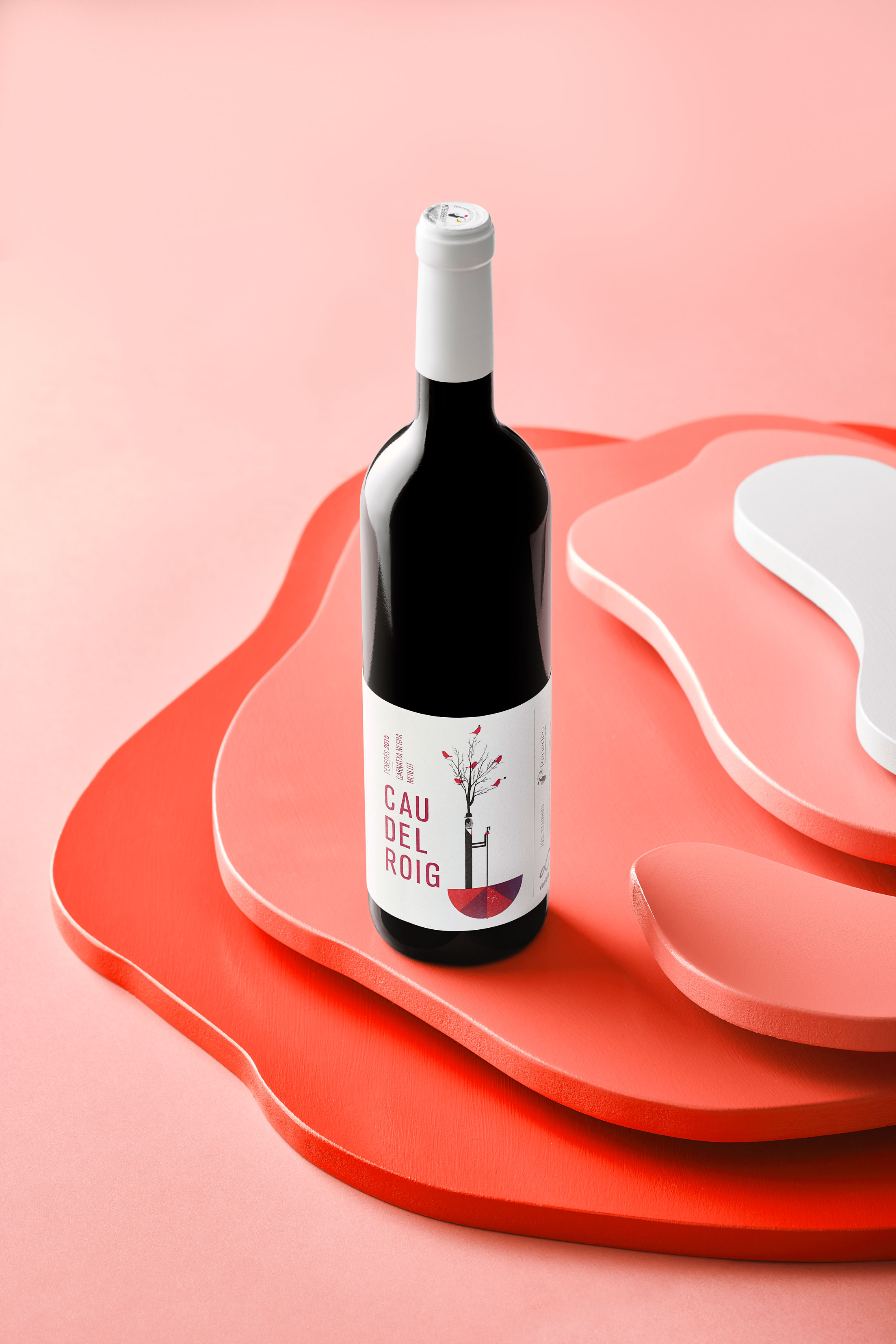
The Varietal 500 brand schematically represents the geography in which their vineyards are planted, El Pla del Manlleu, the highest part of the Penedès. Its location between 500 and 800 meters above sea level, with a great thermal difference between day and night, gives the grape a slow and unique maturation.
This contrast of temperatures resulted in a powerful chromatic range that, together with a linear graph that flows infinitely, represents the peaks and valleys of a territory with more than 1,000 years of history.
At the same time, we create a graphic line full of light and space, generating labels where formal simplicity and punctual —but powerful—color interventions generate a clear identity.
Typography, treated in small blocks of spaced and condensed characters, highlights the name of each product and its variety clearly, without ornaments.
The illustrations, created by Ximo Abadia, reflect the character of the product: full of abstract and inspirational nuances. They present evocative scenes full of impossible situations, represented by an anonymous protagonist.
In terms of production, we print the labels on a broken white paper, slightly textured, that provides warmth and a tactile value to the proposal.
3
3
The results
The results
The results
We create a collection of graphically unified labels, with a totally differentiating proposal, fleeing conventions within their market. We use elegant and simple typography in combination with evocative and dreamy illustrations that move away from the most literal definitions.
We create a collection of graphically unified labels, with a totally differentiating proposal, fleeing conventions within their market. We use elegant and simple typography in combination with evocative and dreamy illustrations that move away from the most literal definitions.
We create a collection of graphically unified labels, with a totally differentiating proposal, fleeing conventions within their market. We use elegant and simple typography in combination with evocative and dreamy illustrations that move away from the most literal definitions.
We create a collection of graphically unified labels, with a totally differentiating proposal, fleeing conventions within their market. We use elegant and simple typography in combination with evocative and dreamy illustrations that move away from the most literal definitions.
We create a collection of graphically unified labels, with a totally differentiating proposal, fleeing conventions within their market. We use elegant and simple typography in combination with evocative and dreamy illustrations that move away from the most literal definitions.


© Baku Creativitat i Comunicació SL
© Baku Creativitat i Comunicació SL
© Baku Creativitat i Comunicació SL
© Baku Creativitat i Comunicació SL
© Baku Creativitat i Comunicació SL