
Identity & packaging for Anna Codina
Identity & packaging for Anna Codina
Identity & packaging for Anna Codina
Identity & packaging for Anna Codina
Identity & packaging for Anna Codina
A cosmetic brand inspired by Cap de Creus
A cosmetic brand inspired by Cap de Creus
A cosmetic brand inspired by Cap de Creus
A cosmetic brand inspired by Cap de Creus
A cosmetic brand inspired by Cap de Creus
DESCRIPTION
DESCRIPTION
DESCRIPTION
Anna Codina —a pharmacist and expert in cosmetic formulation— has devoted her professional career to helping cosmetic brands to research and develop their products. Her personal brand is born with the desire to create a cosmetic line of its own, focused on efficiency and by offering tangible results through advanced formulations.
Anna Codina —a pharmacist and expert in cosmetic formulation— has devoted her professional career to helping cosmetic brands to research and develop their products. Her personal brand is born with the desire to create a cosmetic line of its own, focused on efficiency and by offering tangible results through advanced formulations.
Anna Codina —a pharmacist and expert in cosmetic formulation— has devoted her professional career to helping cosmetic brands to research and develop their products. Her personal brand is born with the desire to create a cosmetic line of its own, focused on efficiency and by offering tangible results through advanced formulations.
Anna Codina —a pharmacist and expert in cosmetic formulation— has devoted her professional career to helping cosmetic brands to research and develop their products. Her personal brand is born with the desire to create a cosmetic line of its own, focused on efficiency and by offering tangible results through advanced formulations.
Anna Codina —a pharmacist and expert in cosmetic formulation— has devoted her professional career to helping cosmetic brands to research and develop their products. Her personal brand is born with the desire to create a cosmetic line of its own, focused on efficiency and by offering tangible results through advanced formulations.
INFO
Client: Anna Codina
Services: Brand consulting, concept, brand, identity manuals, applications
Team involved: 4
Client: Anna Codina
Services: Brand consulting, concept, brand, identity manuals, applications
Team involved: 4
Client: Anna Codina
Services: Brand consulting, concept, brand, identity manuals, applications
Team involved: 4
Client: Anna Codina
Services: Brand consulting, concept, brand, identity manuals, applications
Team involved: 4
Client: Anna Codina
Services: Brand consulting, concept, brand, identity manuals, applications
Team involved: 4
1
1
The challenge
The challenge
The challenge
The project starts with the need to create a specific identity for a range of high quality aesthetic products, produced so far to be marketed through pharmacies and beauty centers. To be marketed through the client's name, there arises the need to create a specific logo, establish a visual identity and produce an ecosystem that especially involves product packaging.
The project starts with the need to create a specific identity for a range of high quality aesthetic products, produced so far to be marketed through pharmacies and beauty centers. To be marketed through the client's name, there arises the need to create a specific logo, establish a visual identity and produce an ecosystem that especially involves product packaging.
The project starts with the need to create a specific identity for a range of high quality aesthetic products, produced so far to be marketed through pharmacies and beauty centers. To be marketed through the client's name, there arises the need to create a specific logo, establish a visual identity and produce an ecosystem that especially involves product packaging.
The project starts with the need to create a specific identity for a range of high quality aesthetic products, produced so far to be marketed through pharmacies and beauty centers. To be marketed through the client's name, there arises the need to create a specific logo, establish a visual identity and produce an ecosystem that especially involves product packaging.
2
2
The process
The process
The process
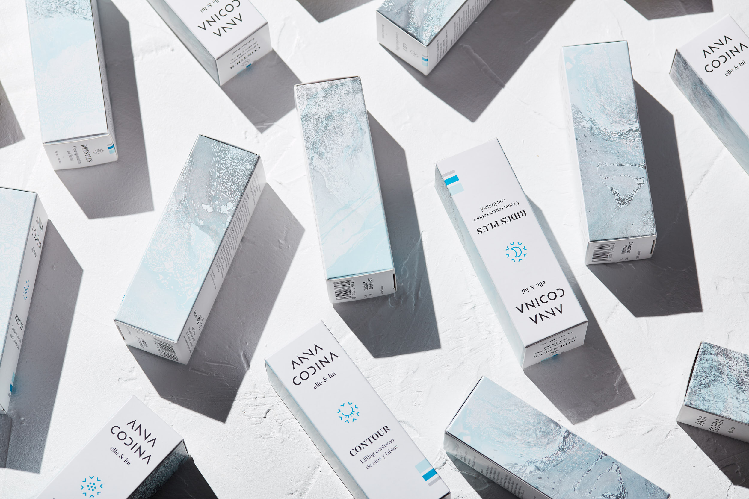
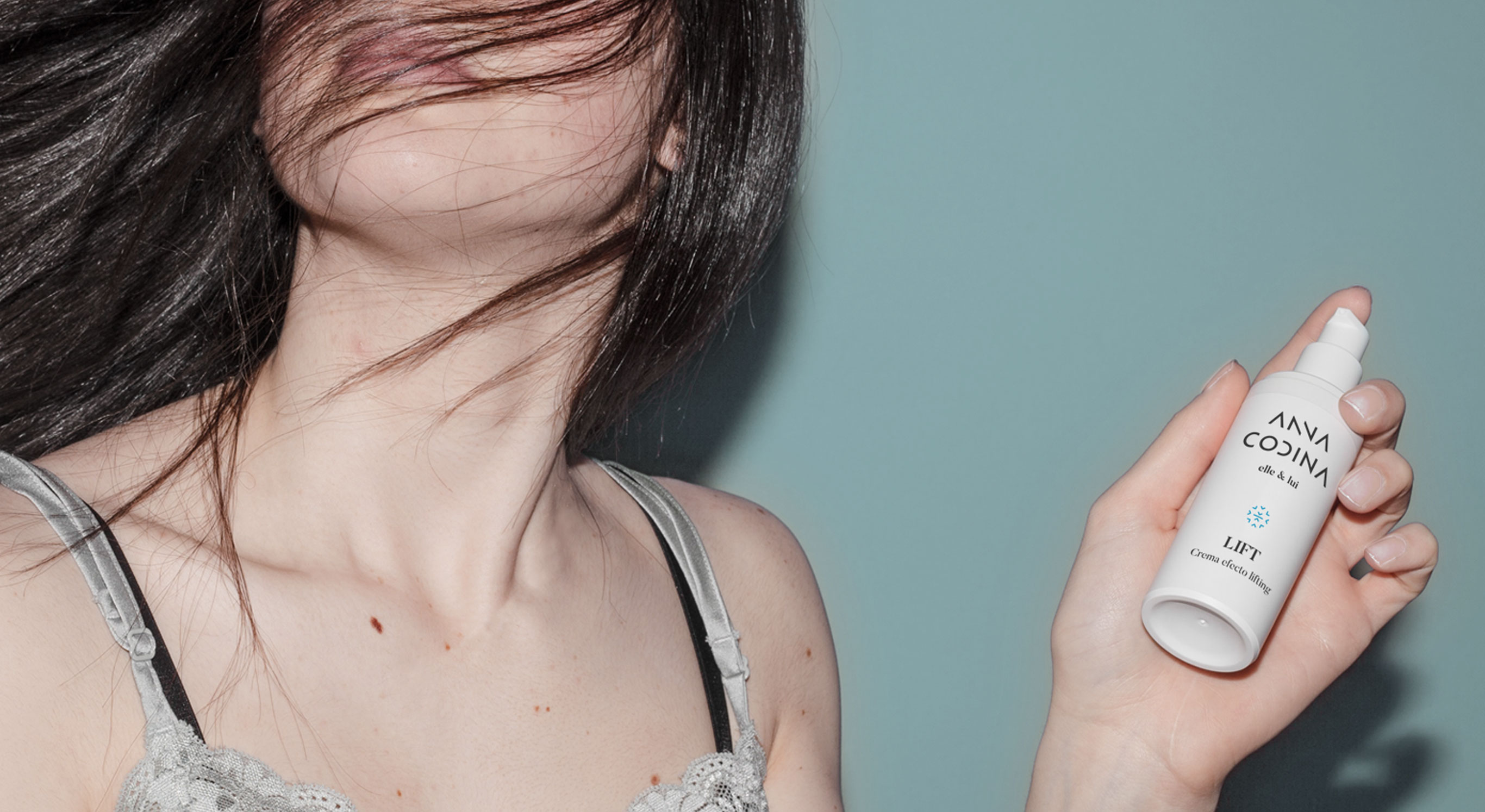
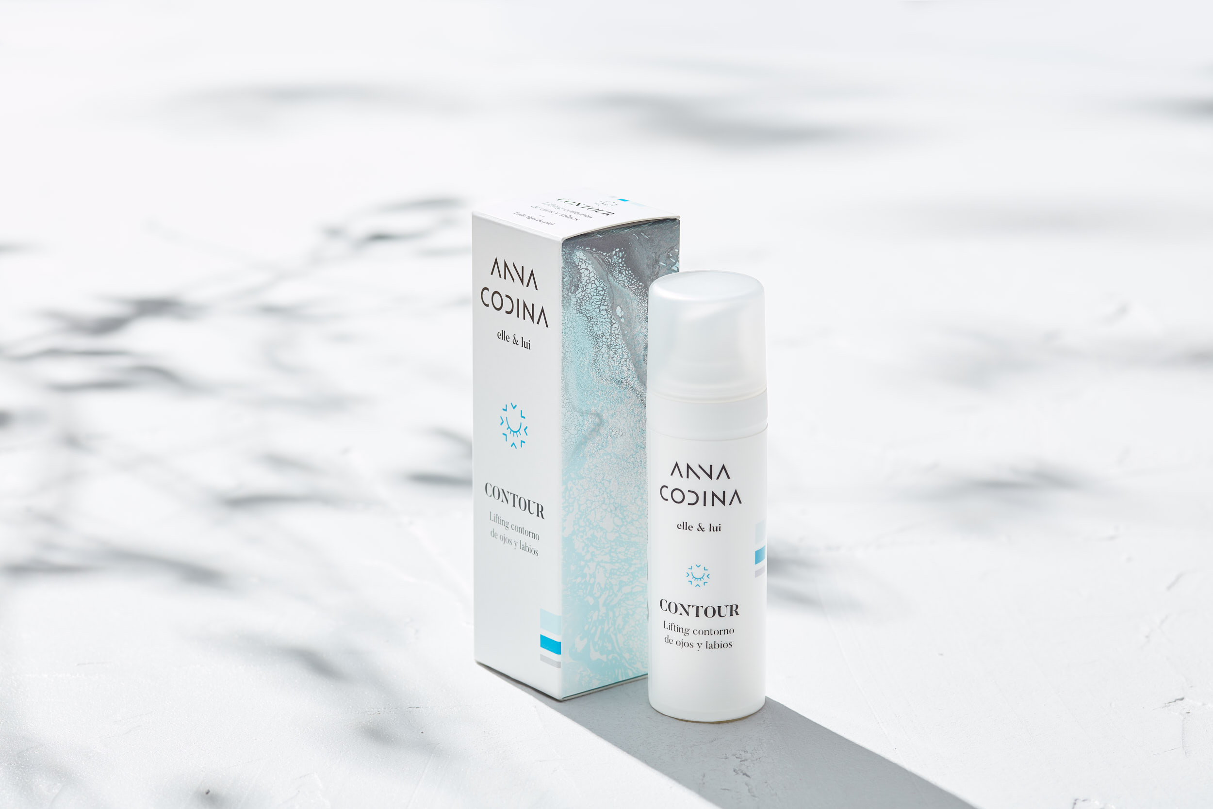
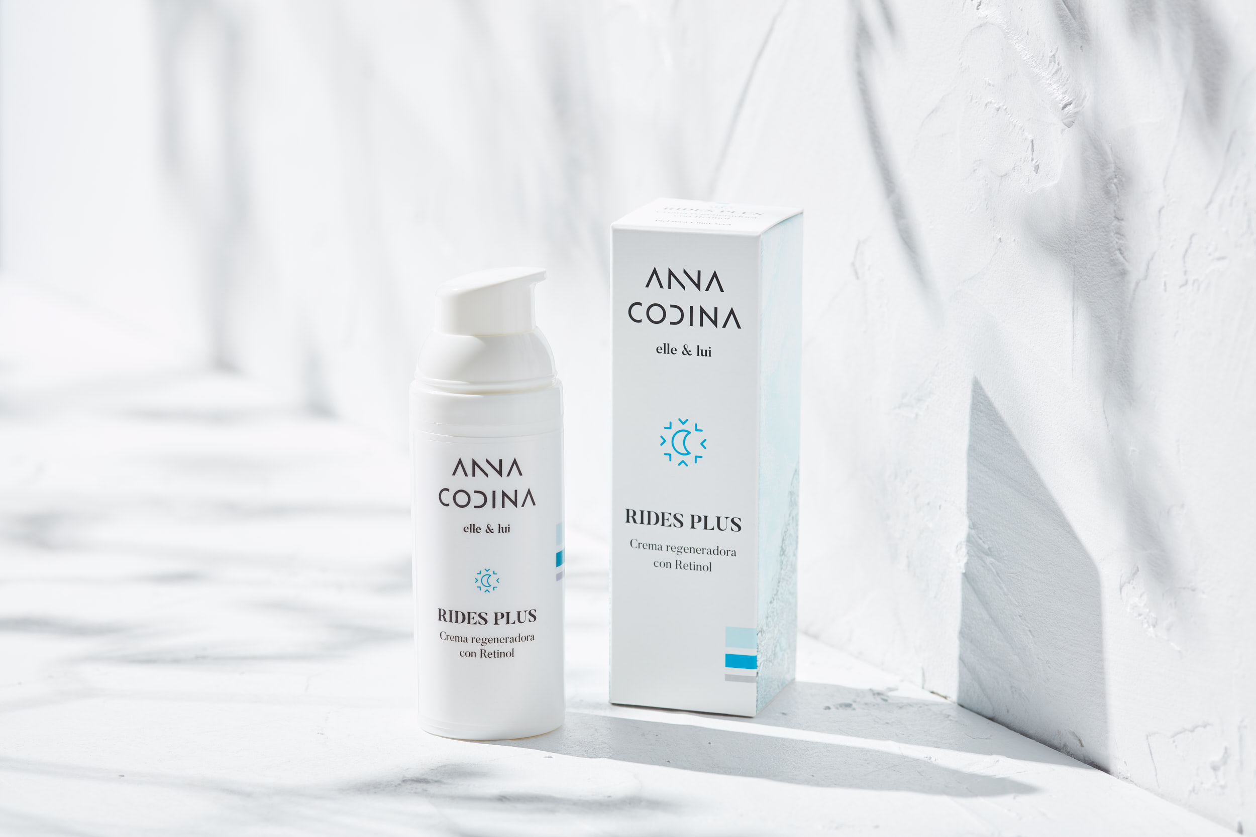
First of all, we create a brand that flees conventions in its sector, with geometric, strong and formally simple characters, along with the sobriety of black on white. We accompany the logo of a serif typography that offers an interesting contrast between contemporaneity and classicism.
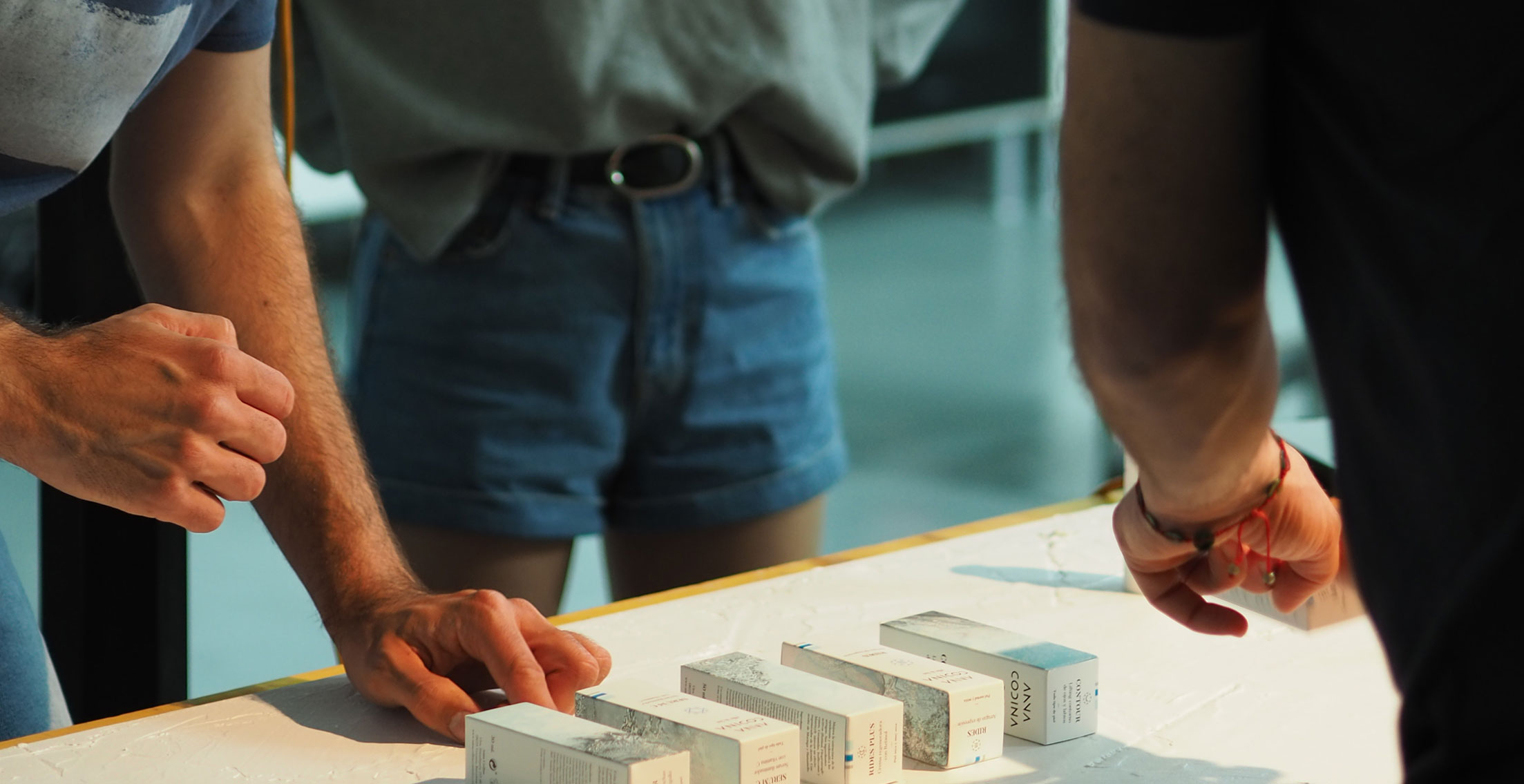
For the identification of each container an iconographic system is created through which to present a wide range of products according to their characteristics or fundamental effects.
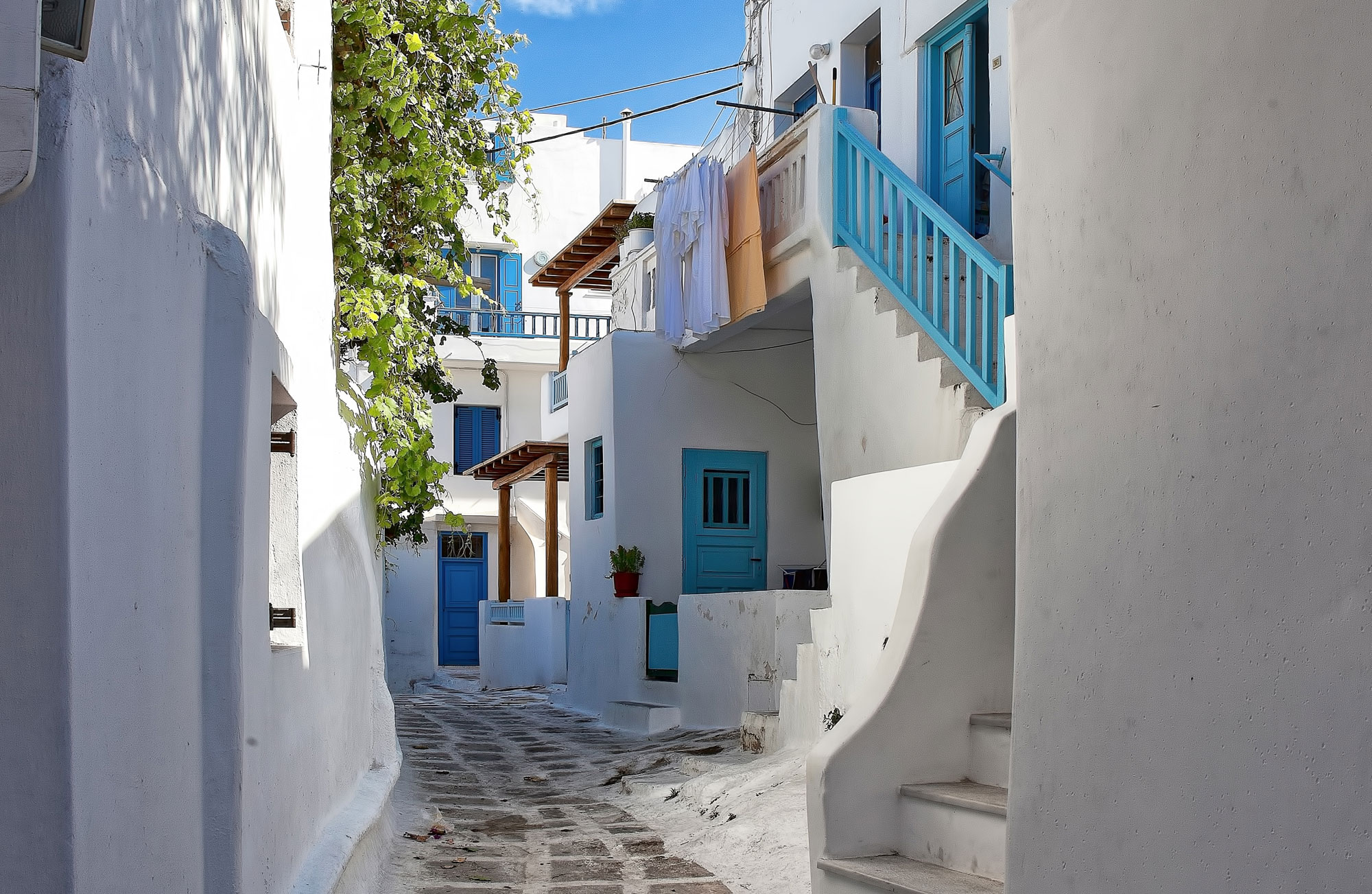
Along with the logo, typographic treatment and iconography, we generate a series of two-color textures inspired by the freshness of the sea: stone, sand, water, salt... creating a visual environment that is reinforced to the maximum in the photographic art direction, where all attributes associated with the brand come to light, forming a beautiful, warm and serene identity.
First of all, we create a brand that flees conventions in its sector, with geometric, strong and formally simple characters, along with the sobriety of black on white. We accompany the logo of a serif typography that offers an interesting contrast between contemporaneity and classicism.
For the identification of each container an iconographic system is created through which to present a wide range of products according to their characteristics or fundamental effects.
Along with the logo, typographic treatment and iconography, we generate a series of two-color textures inspired by the freshness of the sea: stone, sand, water, salt... creating a visual environment that is reinforced to the maximum in the photographic art direction, where all attributes associated with the brand come to light, forming a beautiful, warm and serene identity.
3
3
The results
The results
The results
We obtain a long-range logo and a collection of unified packs, with a neutrality and cleanliness suitable for its sector but with an unusual identifying strength in cosmetic products.
The visual system created allows a continuous growth of the client's product range and the global definition of the brand allows it to land with guarantees to a complex and disputed sector.


© Baku Creativitat i Comunicació SL
© Baku Creativitat i Comunicació SL
© Baku Creativitat i Comunicació SL
© Baku Creativitat i Comunicació SL
© Baku Creativitat i Comunicació SL