Packaging for Cafès Dern
Packaging for Cafès Dern
Packaging for Cafès Dern
Packaging for Cafès Dern
Packaging for Cafès Dern
We have connected a historic roasting and coffee shop with the new speciality coffee audiences
We have connected a historic roasting and coffee shop with the new speciality coffee audiences
We have connected a historic roasting and coffee shop with the new speciality coffee audiencest
We have connected a historic roasting and coffee shop with the new speciality coffee audiences
We have connected a historic roasting and coffee shop with the new speciality coffee audiences

DESCRIPTION
DESCRIPTION
DESCRIPTION
Cafès Dern –founded in 1953 in Terrassa (Barcelona)– is the landmark coffee shop in the city. Dedicated in body and soul to coffee roasting and selling (both to individuals and companies), they have a select range of coffees from around the world.
Their brand is synonymous of the professionalism and savoir faire that they have preserved over the three generations that have run the business, focused on offering the best product and consultancy to their customers.
INFO
Client: Cafès Dern
Services: Packaging design and promotional items
Team involved: 2
Client: Cafès Dern
Services: Packaging design and promotional items
Team involved: 2
Client: Cafès Dern
Services: Packaging design and promotional items
Team involved: 2
Client: Cafès Dern
Services: Packaging design and promotional items
Team involved: 2
1
1
The challenge
The challenge
The challenge
The project starts with the need to connect Cafès Dern with the demand of new audiences, oriented to specialty coffee. And also the desire to offer reusable coffee packs to all its customers, encouraging a more responsible consumption and a lower environmental impact.
The project starts with the need to connect Cafès Dern with the demand of new audiences, oriented to specialty coffee. And also the desire to offer reusable coffee packs to all its customers, encouraging a more responsible consumption and a lower environmental impact.
The project starts with the need to connect Cafès Dern with the demand of new audiences, oriented to specialty coffee. And also the desire to offer reusable coffee packs to all its customers, encouraging a more responsible consumption and a lower environmental impact.
The project starts with the need to connect Cafès Dern with the demand of new audiences, oriented to specialty coffee. And also the desire to offer reusable coffee packs to all its customers, encouraging a more responsible consumption and a lower environmental impact.
The project starts with the need to connect Cafès Dern with the demand of new audiences, oriented to specialty coffee. And also the desire to offer reusable coffee packs to all its customers, encouraging a more responsible consumption and a lower environmental impact.
2
2
The process
The process
The process
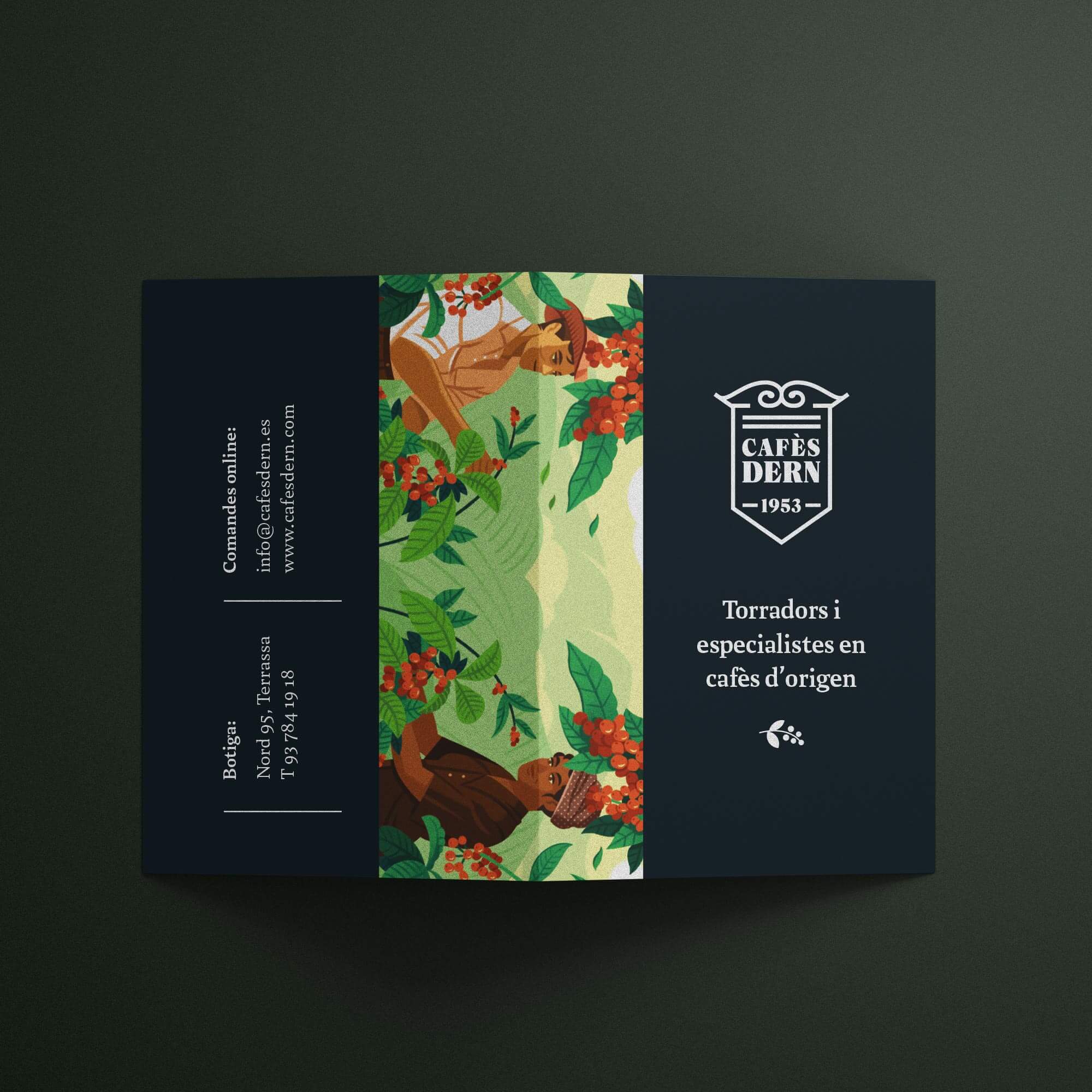
To capture the attention of new audiences focused on specialty coffee, we have created a pocket card in diptych format, designed for the establishment to stamp each purchase indicating the origin of the coffee that the customer has chosen –among others: Brazil, Burundi, Colombia , Costa Rica, Ethiopia, Guatemala, Kenya, Nicaragua, Papua New Guinea, Sumatra and Rwanda.
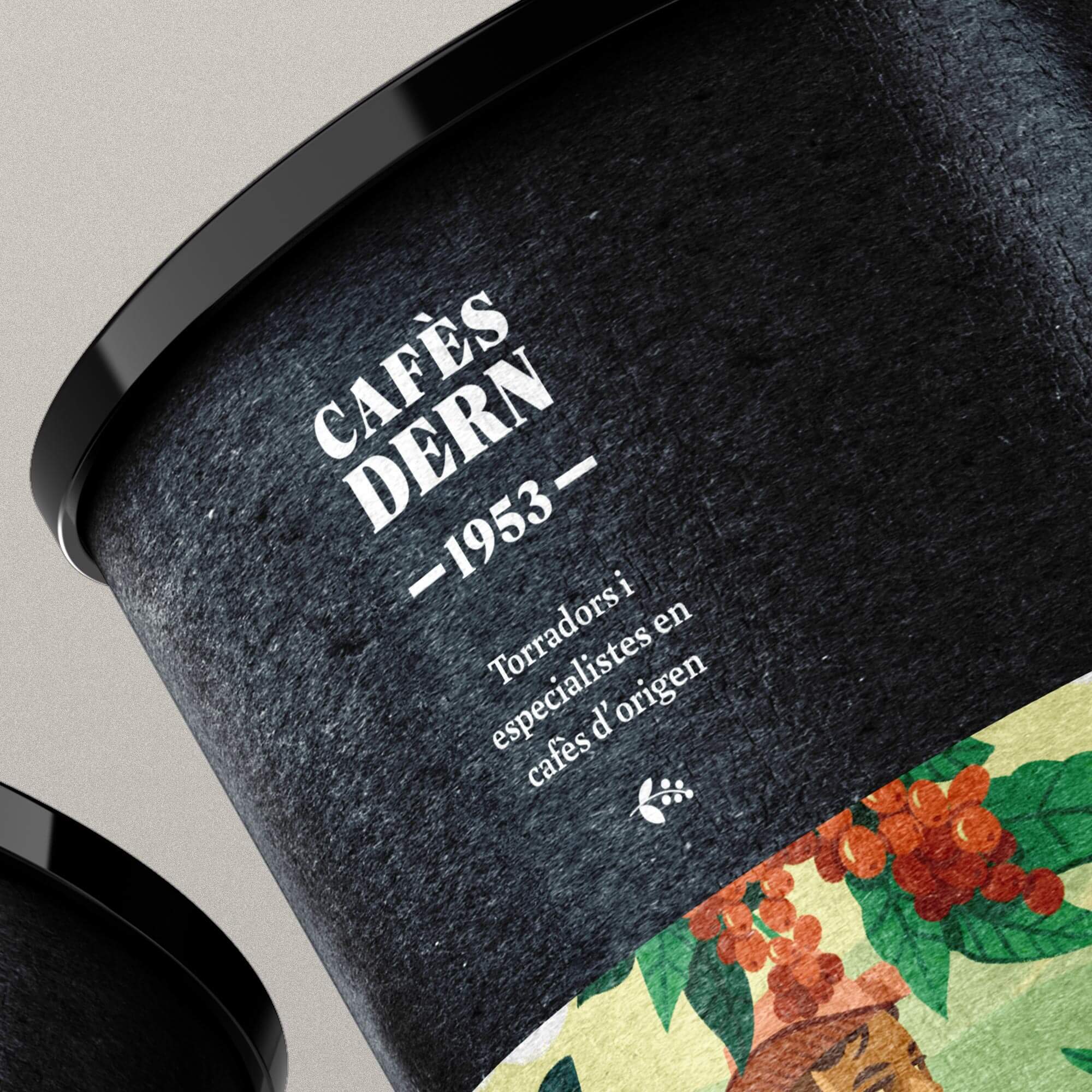
The outside of the card evokes the aesthetic feature of a passport. To reinforce this aesthetic, we have recovered the first logo of the company, which dates from 1953 and is expressed as a heraldic shield. And we applied it on a sober black, combining it with a fragment of the illustration that we also use on the packaging. The card contains a world map and a checklist of available coffees based on their origin inside.
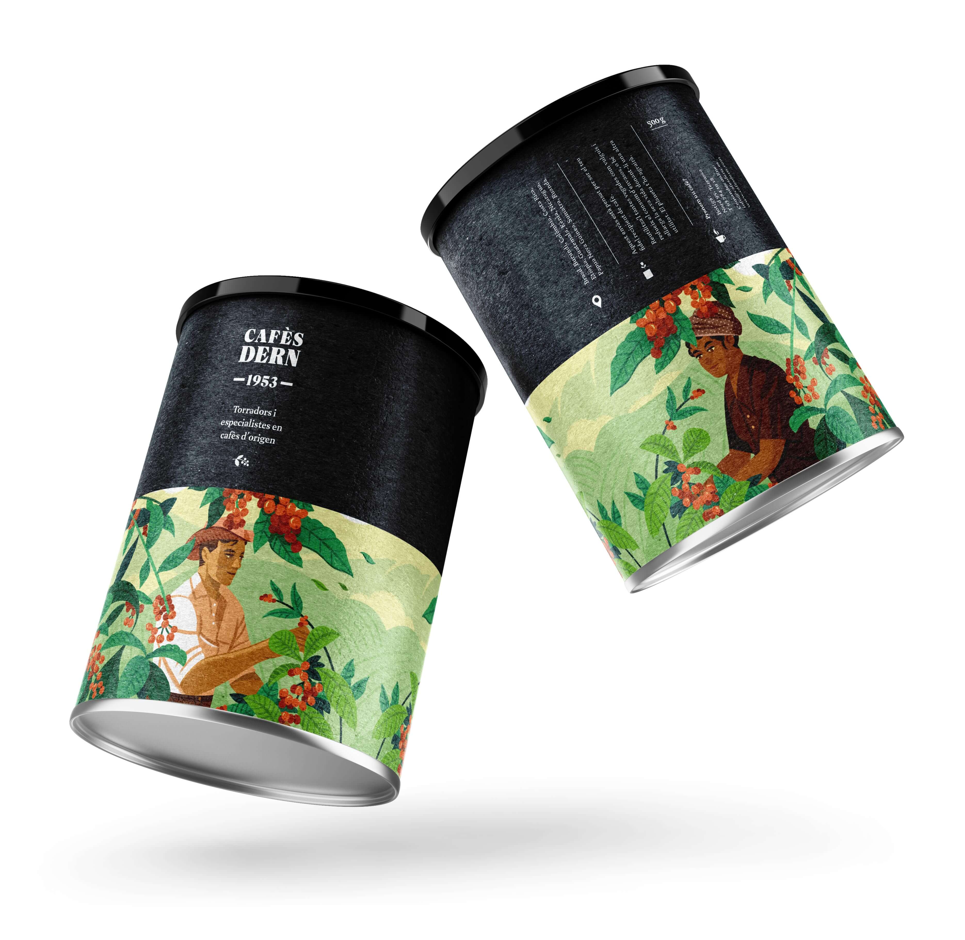
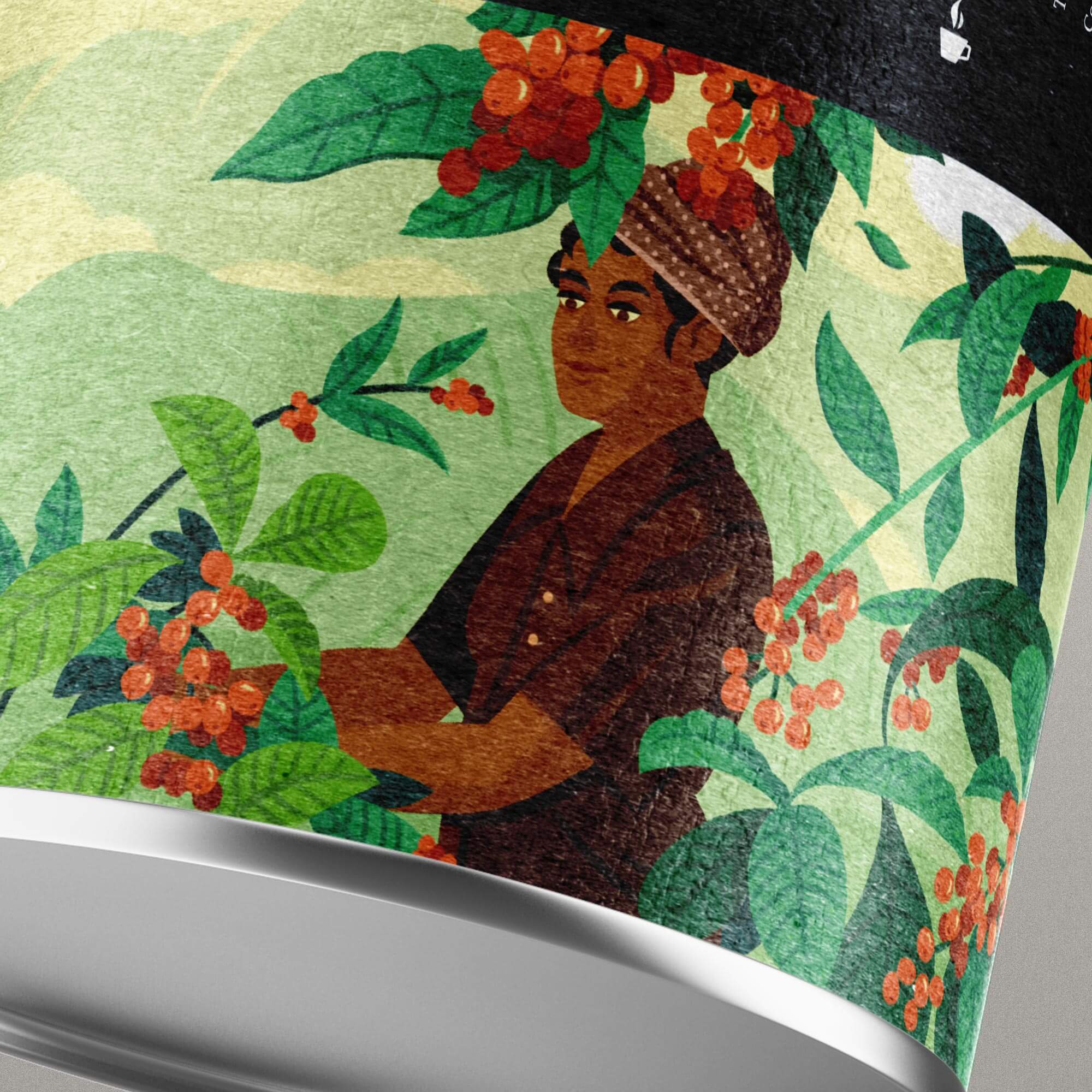
We designed the reusable coffee container with an illustration by Raúl Gil, created especially for this project. The illustration, which surrounds the entire packaging, presents an evocative scene –the moment of collection on a coffee farm– and reflects the noble and warm character of the product.
3
3
The result
The result
The result
We get two promotional items: the card and the packaging –designed to give away customers who complete a certain number of stamps on the card– which raise the perception of the product and at the same time, it helps to retain customers and attract new audiences.
We get two promotional items: the card and the packaging –designed to give away customers who complete a certain number of stamps on the card– which raise the perception of the product and at the same time, it helps to retain customers and attract new audiences.
We get two promotional items: the card and the packaging –designed to give away customers who complete a certain number of stamps on the card– which raise the perception of the product and at the same time, it helps to retain customers and attract new audiences.
We get two promotional items: the card and the packaging –designed to give away customers who complete a certain number of stamps on the card– which raise the perception of the product and at the same time, it helps to retain customers and attract new audiences.
We get two promotional items: the card and the packaging –designed to give away customers who complete a certain number of stamps on the card– which raise the perception of the product and at the same time, it helps to retain customers and attract new audiences.


© Baku Creativitat i Comunicació SL
© Baku Creativitat i Comunicació SL
© Baku Creativitat i Comunicació SL
© Baku Creativitat i Comunicació SL
© Baku Creativitat i Comunicació SL