
Ricardo i Montse branding
Ricardo i Montse branding
Ricardo i Montse branding
Ricardo i Montse branding
Ricardo i Montse branding
An identity that adapts to the new times, reinforcing its traditional values
An identity that adapts to the new times, reinforcing its traditional values
An identity that adapts to the new times, reinforcing its traditional values
An identity that adapts to the new times, reinforcing its traditional values
An identity that adapts to the new times, reinforcing its traditional values
DESCRIPTION
DESCRIPTION
DESCRIPTION
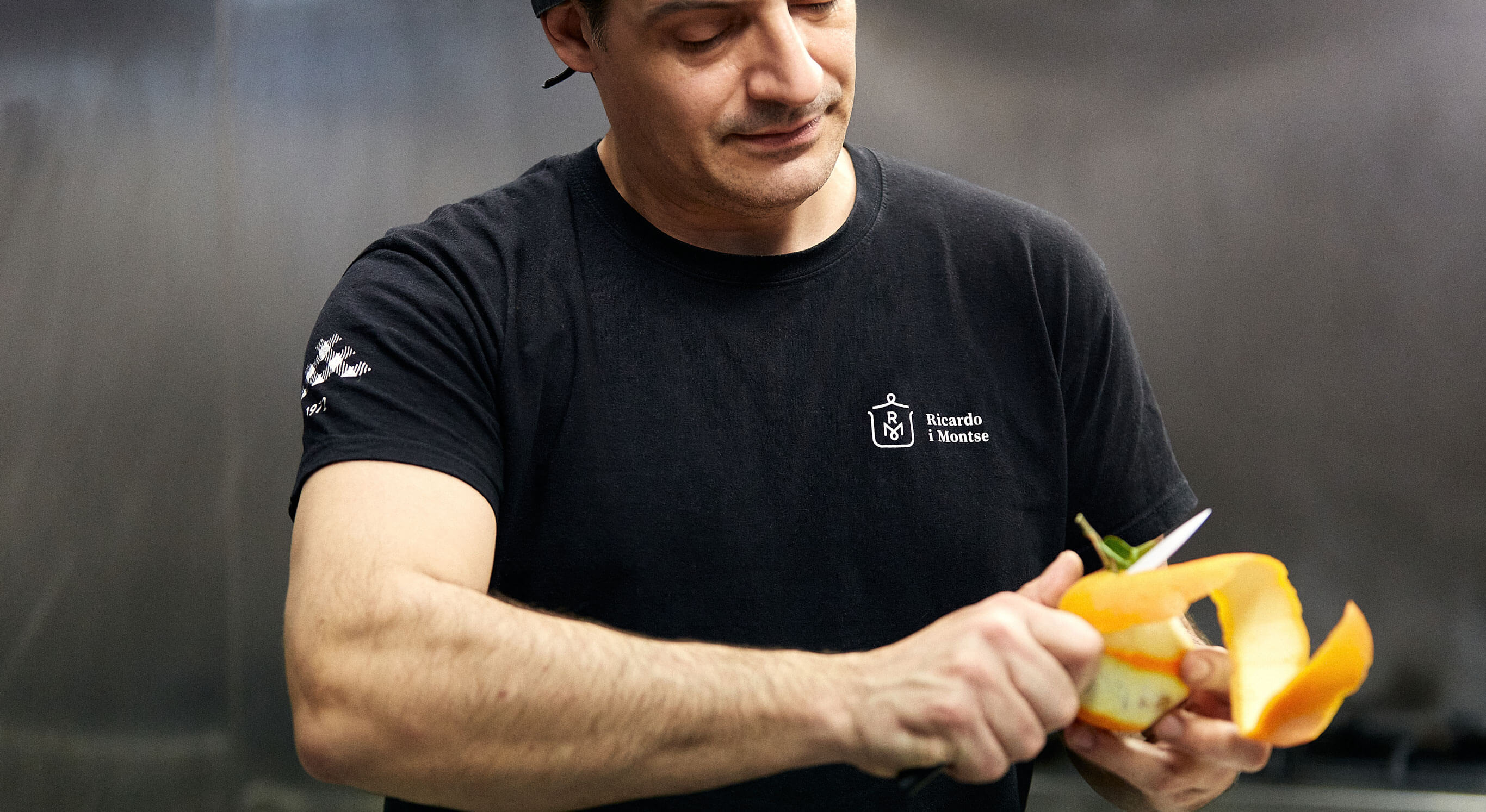
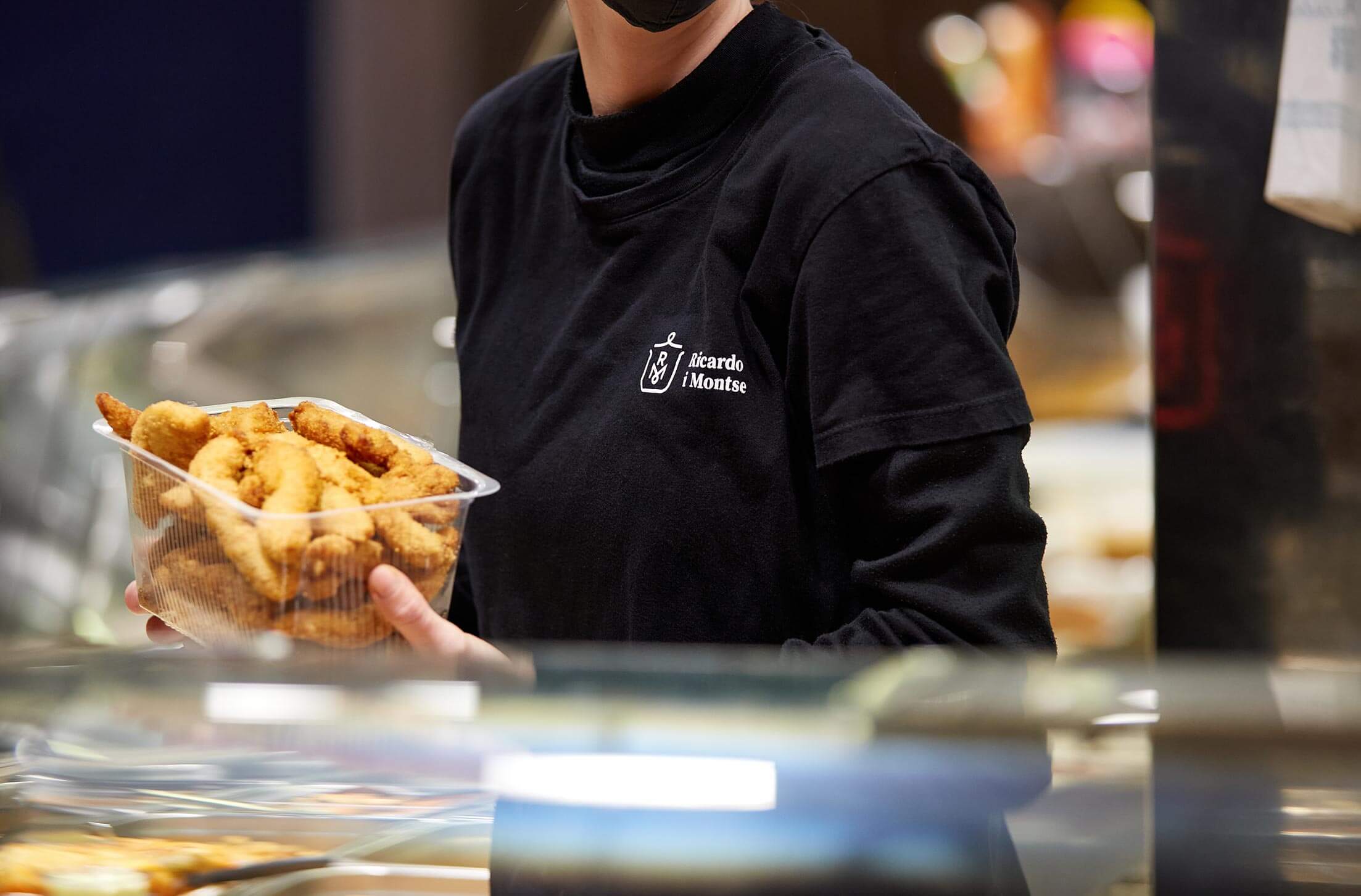
Ricardo i Montse cooks healthy and homemade food to facilitate the daily meals of professionals who do not have time to cook, but who want to enjoy a good meal every day in a simple way.
Its brand is traditional and yet the business have undergone a significant transformation, going from managing a single and successful position in the Mercat de la Independència de Terrassa to opening new stores and expanding to other cities.
INFO
Client: Ricardo i Montse
Services: Brand consulting, concept, brand, identity manuals, applications
Team involved: 4
Client: Ricardo i Montse
Services: Brand consulting, concept, brand, identity manuals, applications
Team involved: 4
Client: Ricardo i Montse
Services: Brand consulting, concept, brand, identity manuals, applications
Team involved: 4
Client: Ricardo i Montse
Services: Brand consulting, concept, brand, identity manuals, applications
Team involved: 4
Client: Ricardo i Montse
Services: Brand consulting, concept, brand, identity manuals, applications
Team involved: 4
1
1
The challenge
The challenge
The challenge
The project starts with the need to create an identity that adapts to the new times the brand is experiencing and its challenges, considering the desire to expand the business with new establishments –beyond its original ecosystem (the market)–, but without forgetting the traditional values that caracterize it.
The project starts with the need to create an identity that adapts to the new times the brand is experiencing and its challenges, considering the desire to expand the business with new establishments –beyond its original ecosystem (the market)–, but without forgetting the traditional values that caracterize it.
The project starts with the need to create an identity that adapts to the new times the brand is experiencing and its challenges, considering the desire to expand the business with new establishments –beyond its original ecosystem (the market)–, but without forgetting the traditional values that caracterize it.
The project starts with the need to create an identity that adapts to the new times the brand is experiencing and its challenges, considering the desire to expand the business with new establishments –beyond its original ecosystem (the market)–, but without forgetting the traditional values that caracterize it.
2
2
The process
The process
The process
We have created a brand that is expressed with a compact symbol, halfway between a heraldic seal and a figurative representation of the focus of the business. To the main brand, in its basic layout, we add the tagline (‘Eat well. We make it easy for you’), which helps us to reinforce its positioning and two key points of its identity: quality product and to make things easier.
The corporate typeface is Source Serif Pro, a classic font with a very contemporaRy design, with a good weight and a certain amount of tradition. It provides credibility and refers us to the traditional values of the brand. We complement the main typeface with Brandon Text, a sans-serif font with slightly rounded finishes and a mechanical touch that provides a good formal contrast.
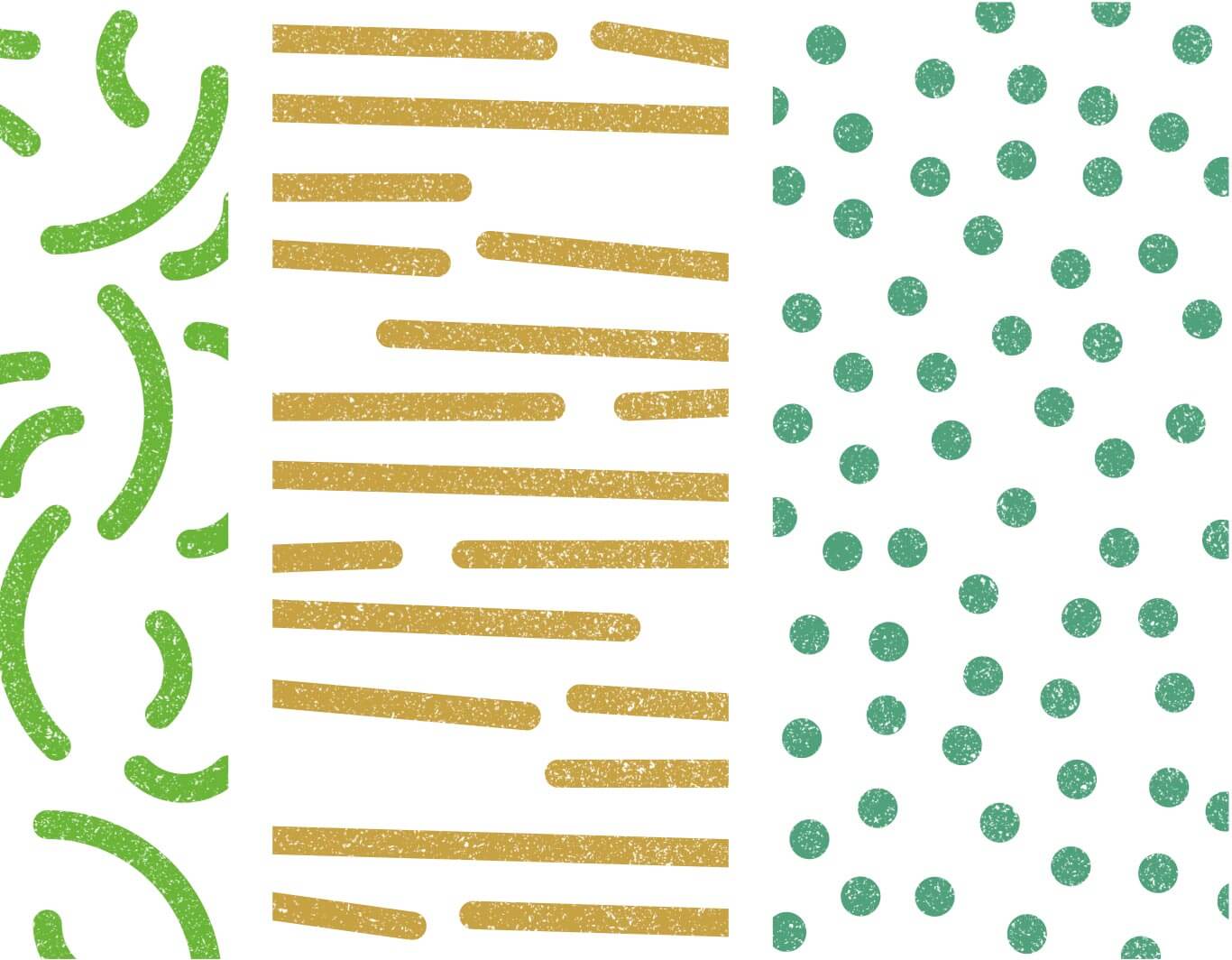
Accompanying the brand in its basic dispositions, we created an accessory graphic that presents a visual system that helps us transmit the main and secondary values. The game of textures brings abstractions of different foods together, creating a system that we can decompose and reconstruct according to the needs of each context and that transmits variety, simplicity and color. In addition to the textures system, we have an additional identity element that we can use in a very controlled way in corporate applications that require small graphic interventions. A triangular element reminiscent of traditional tablecloths, with checkered and striped patterns. Having it prevents us from overusing the brand symbol, diversifying the visual discourse.
We have created a brand that is expressed with a compact symbol, halfway between a heraldic seal and a figurative representation of the focus of the business. To the main brand, in its basic layout, we add the tagline (‘Eat well. We make it easy for you’), which helps us to reinforce its positioning and two key points of its identity: quality product and to make things easier.
The corporate typeface is Source Serif Pro, a classic font with a very contemporaRy design, with a good weight and a certain amount of tradition. It provides credibility and refers us to the traditional values of the brand. We complement the main typeface with Brandon Text, a sans-serif font with slightly rounded finishes and a mechanical touch that provides a good formal contrast.
Accompanying the brand in its basic dispositions, we created an accessory graphic that presents a visual system that helps us transmit the main and secondary values. The game of textures brings abstractions of different foods together, creating a system that we can decompose and reconstruct according to the needs of each context and that transmits variety, simplicity and color. In addition to the textures system, we have an additional identity element that we can use in a very controlled way in corporate applications that require small graphic interventions. A triangular element reminiscent of traditional tablecloths, with checkered and striped patterns. Having it prevents us from overusing the brand symbol, diversifying the visual discourse.
3
3
The results
The results
The results
We obtained a lasting brand, which vindicates the traditional values of the business –fully in force– and which is modernized to become an identity with its own personality, easy to identify.
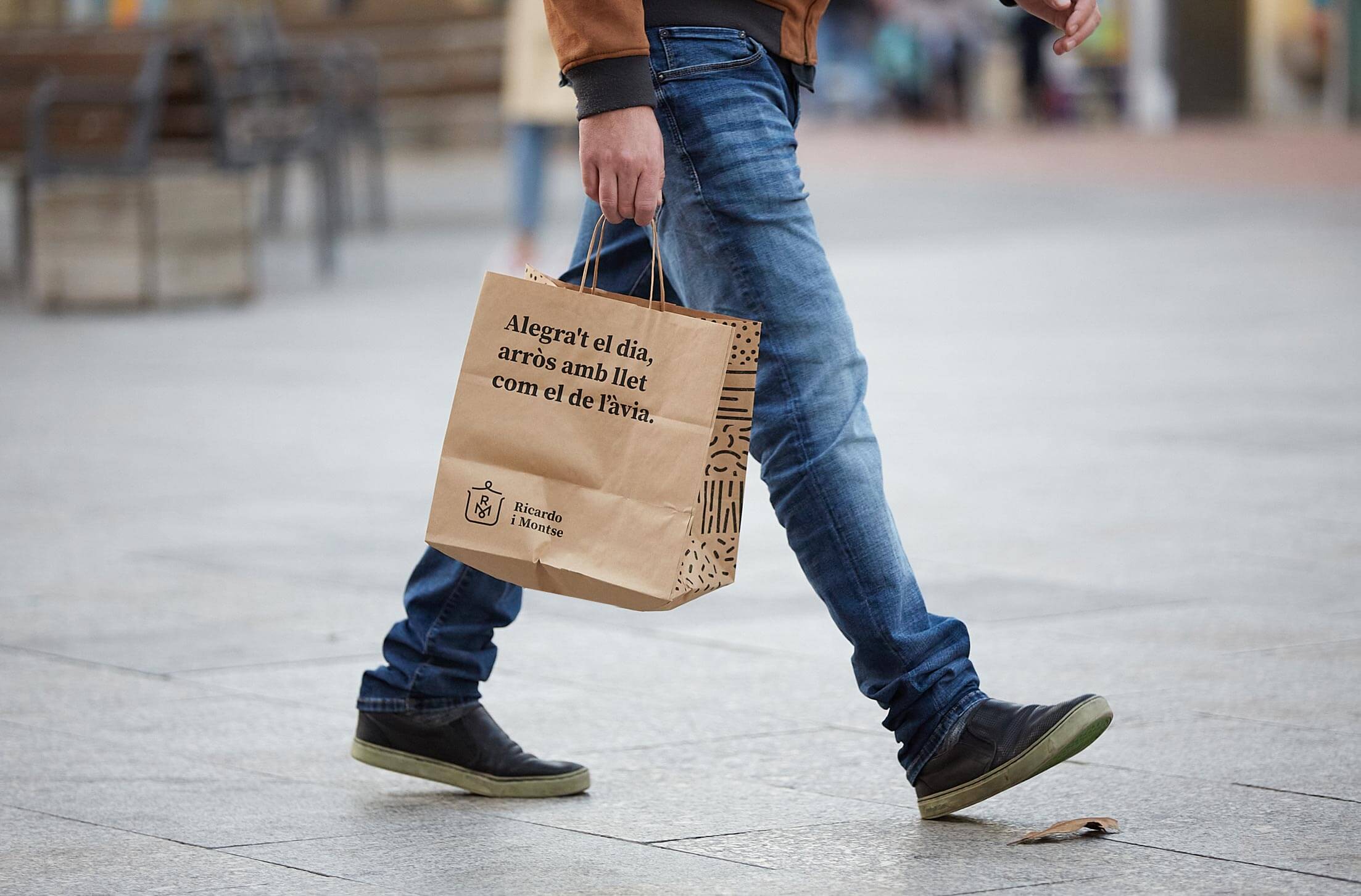
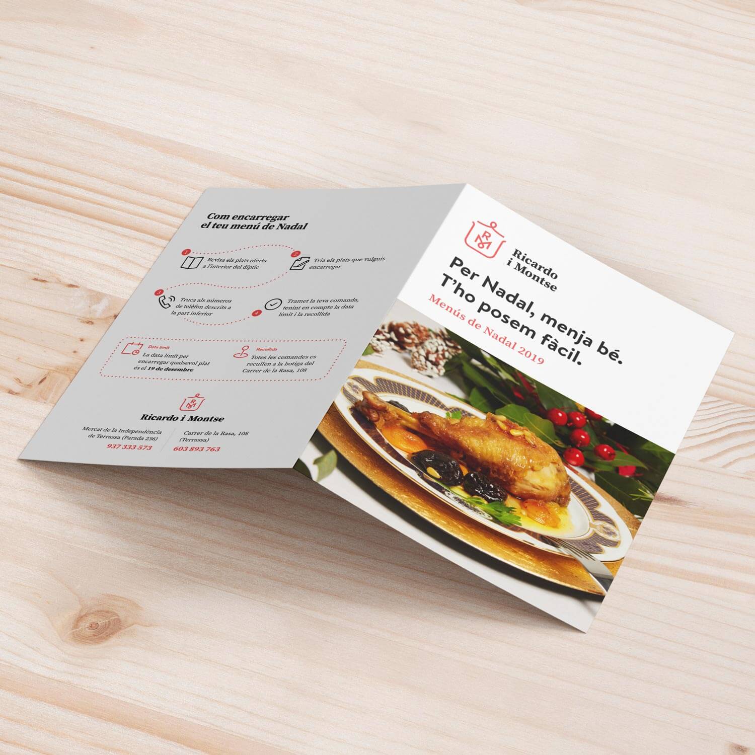
The visual identity manual includes the brand, its rules of use and the accessory graphics system, as well as different specific applications of corporate and digital stationery, and elements of advertising graphics.
We obtained a lasting brand, which vindicates the traditional values of the business –fully in force– and which is modernized to become an identity with its own personality, easy to identify.
The visual identity manual includes the brand, its rules of use and the accessory graphics system, as well as different specific applications of corporate and digital stationery, and elements of advertising graphics.


© Baku Creativitat i Comunicació SL
© Baku Creativitat i Comunicació SL
© Baku Creativitat i Comunicació SL
© Baku Creativitat i Comunicació SL
Privacitat. Cookies. Avís legal.